


@DylandeBruijn
Posted
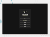
@akorir08y
Hiya! 👋
Congratulations on your solution, it looks very close to the design! I can tell you put a lot of effort into it.
Things you could improve ✍️
-
I suggest adding a bit of
paddingto yourbodyelement so the card has some space around it on smaller viewports. -
Try experimenting with CSS variables, they help you make your CSS values more reusable across your code.
-
Try using using relative CSS units like
remandemthey make your layout more adaptable. -
Try putting your links in a list (
ul) to make your code more semantic. -
I would use
atags for your links instead ofbuttontags.
I hope you find my feedback helpful! 🌟
Let me know if you have more questions and I'll do my best to answer them. 🙋♂️
Happy coding! 😎
Marked as helpful
@akorir08y
Posted
@DylandeBruijn Thank you. Much Appreciated
