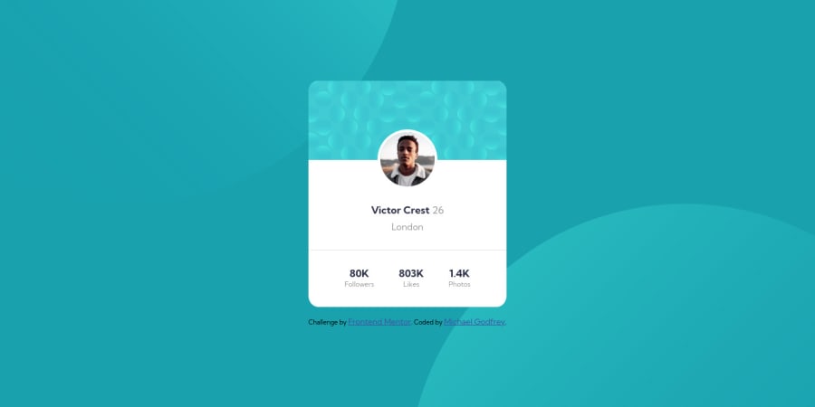
Design comparison
Solution retrospective
This is my first Frontend Mentor challenge. I think the styles are close but I'm not sure about the positioning of elements and sizes etc. Also I only checked it on Chrome browser.
I welcome feedback and constructive criticism, it was challenging to vertically center the card and position the background images and I just tried stuff until something worked.
Community feedback
- @rsrclabPosted almost 3 years ago
Hi, @michagodfrey ~
Congratulate on your solution to FM challenges. I have studied your work, and learned a lot from it. Great work! Here are some of the tips I like to provide.
- About background images, try to use pseudo elements like ::before and ::after. It is much easier to implement background using it than using elements.
- I think card width mustn't set as width, but using max-width.
- I hope you to try BEM structuring if you have a chance. It will be a big help on bigger proejcts.
https://www.frontendmentor.io/solutions/profile-card-solution-m-cH4D2Lp
Here is my solution to this challenge. If you can get something from it, it would be great happy to me.
Happy coding ~
Marked as helpful2@michagodfreyPosted almost 3 years agothanks @tymren608 ! I've been putting off learning pseudo elements and using a naming convention for elements so it's time to look into those. And thanks for sharing your project, I'll give that a look.
0 - @eTyradelliPosted almost 3 years ago
Hi @michagodfrey,
Job well done on this one!
Looking at your code, here's a couple of things that may help you moving forward:
-
CSS reset: This is are a very common way to start styling your project without having to deal with the HTML defaults, like the default margins of the <body> element. If you Google css reset, you'll see there are a few ways to go about it. Here's an example: https://piccalil.li/blog/a-modern-css-reset/
-
CSS grid for layout: By setting display:grid on the <body> and working with grid-template-columns and grid-template-rows or with grid-template-areas for more complex layouts, it becomes very easy to center things horizontally and vertically. Grid-template-areas are especially helpful for responsive layouts, because they offer an easy way to move things around and change their order, depending on the size of the screen.
-
As @tymren608 suggested, try to use ::after and ::before for the bg circles, and positioning them absolutely, so they won't interfere with the height of the <body> and consequently the page.
Keep it up!
Marked as helpful1@michagodfreyPosted almost 3 years agoThank you @eTyradelli ! Thanks for the positive feedback, I'm actually blown away by how helpful everyone has been and I uncovered some blind spots. I'll follow up and work on all the points you made.
0 -
- @darryncodesPosted almost 3 years ago
Hi Michael,
Really solid effort - well done.
I'd recommend clearing down your accessibility report, there is a ton of useful information to be learnt there and a good habit to get into
- swap
<div class="wrapper">
with<main class="wrapper">
, swap<div class="attribution">
with<footer class="attribution">
. Using descriptive mark up is really important - your design should include one heading 1
All the best!
Marked as helpful1@michagodfreyPosted almost 3 years agoThank you @darryncodes ! Yes, I saw those warnings and opened the links so I can go over them today. I'm getting so much out of this small project I coded, I will be doing more challenges here I think.
0@darryncodesPosted almost 3 years agoGlad to hear it @michagodfrey, it's the best way to learn!
1 - swap
- @grace-snowPosted almost 3 years ago
Hey you've had a ton of feedback already, all great stuff ☺
So I'll only add to use max width and no height on the card. And make sure the card doesn't hit screen edges on mobile - max width and a little margin on the card would sort that, or padding on its wrapping element
Good luck
Marked as helpful0
Please log in to post a comment
Log in with GitHubJoin our Discord community
Join thousands of Frontend Mentor community members taking the challenges, sharing resources, helping each other, and chatting about all things front-end!
Join our Discord