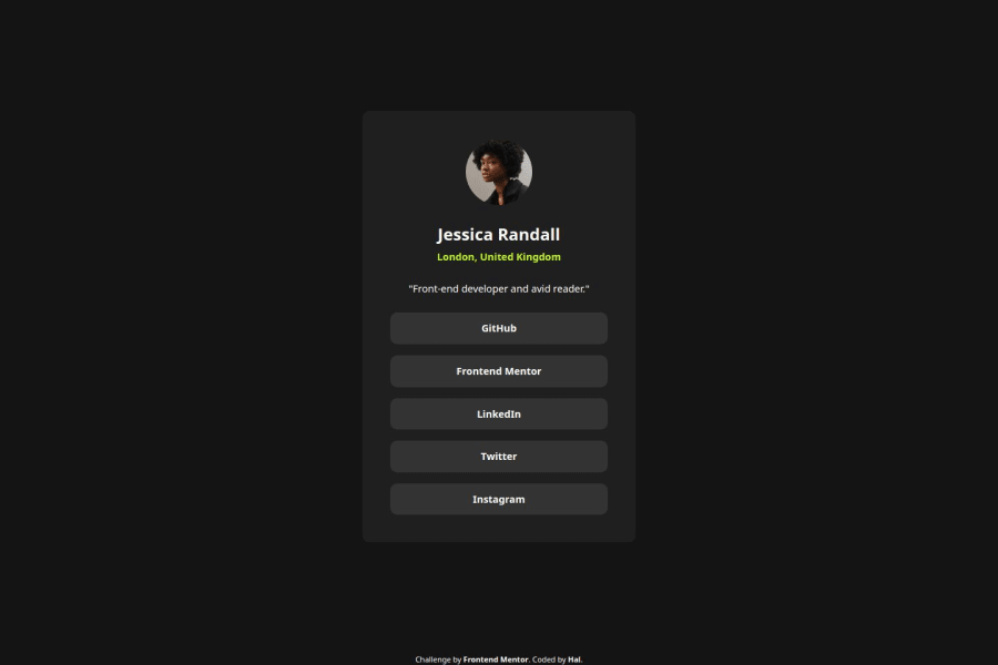
Design comparison
Solution retrospective
Last two exercises were Flex-only, so I opted to do just Grid with this one. Managed to completely avoid using divs and got by with just semantic elements.
Really happy with how it all came together. Flex seemed like the obvious choice here and I haven't practiced Grid in a while, so it was a nice change of pace.
What challenges did you encounter, and how did you overcome them?Was a bit rusty on Grid, so it was a bit cumbersome at first. It was just a single column of elements, so Flex was much more fitting. Still, by the end, I got a good hang of it.
Community feedback
- @AdrianoEscarabotePosted 6 months ago
Hi FirstHalcyon, how’s everything? I think your project turned out great! However, I have some feedback that I think might be useful:
To enhance the semantics of your code, consider using a
<ul>(unordered list) for the collection of links, as it represents a list of related items. Here's an example:<ul> <li><a href="#">GitHub</a></li> <li><a href="#">Frontend Mentor</a></li> <li><a href="#">LinkedIn</a></li> <li><a href="#">Twitter</a></li> <li><a href="#">Instagram</a></li> </ul>Using a
<ul>provides clear structure and context, signaling to both browsers and assistive technologies that these links are part of a cohesive group, improving both accessibility and readability.The rest is amazing.
I hope this is helpful. 👍
Marked as helpful1@FirstHalcyonPosted 6 months ago@AdrianoEscarabote It is very helpful, thank you! I'll try to keep it in mind for my next list of elements.
1 - @DannimationsPosted 6 months ago
You did a very good job, especially with the dimensions of the main div, which are almost identical to that of the original project. Keep at it! :)
1
Please log in to post a comment
Log in with GitHubJoin our Discord community
Join thousands of Frontend Mentor community members taking the challenges, sharing resources, helping each other, and chatting about all things front-end!
Join our Discord
