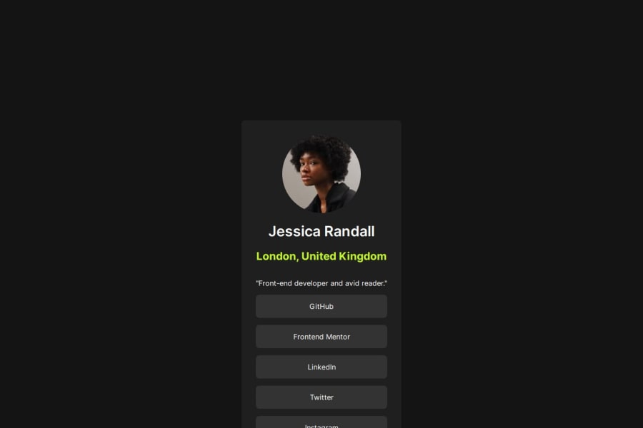
Design comparison
SolutionDesign
Solution retrospective
What are you most proud of, and what would you do differently next time?
I am happy I was able to use flex and grid with the help of the developer tool in Microsoft Edge in order to do this and was able to structure my work a bit more better than last time in order for it to be more readable and accessible for anyone.
What challenges did you encounter, and how did you overcome them?Basically,it was a bit of a challenge using both flex and grid to make the website as close to the original design as possible,but it was cool.
What specific areas of your project would you like help with?Well,I think I'm cool but I don't think I got the BEM naming convection that accurately. Some tips on that could help. Thanks 🙏
Community feedback
Please log in to post a comment
Log in with GitHubJoin our Discord community
Join thousands of Frontend Mentor community members taking the challenges, sharing resources, helping each other, and chatting about all things front-end!
Join our Discord
