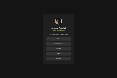
Design comparison
Solution retrospective
I am most proud of the hover feature which I implemented for the first time ever.
What challenges did you encounter, and how did you overcome them?I did not know how to center elements using flexbox which I figured out.
What specific areas of your project would you like help with?How do I use rems and ems if the font-sizes are not nice multiples of each other. Specifically, in the case of this project, they were 24px and 14px, both of which are not nice multiples of 16. And 24 is not a nice multiple of 14. I could use rems and ems but it would look ugly (by ugly I mean if the root font size is 14px, then 24px would be around 1.714rem). Should I still use them in this case? Or is there a better way to go about this issue?
Community feedback
- @StroudyPosted about 2 months ago
Hello again, Incredible work on this! You’re making great strides, and I have a couple of suggestions that might push it even further…
- I would put these into a
<ul> <li>
, and the text should be wrapped with a<a>
so it is accessible with a keyboard using the tab key, Using an<a>
tag for navigation is semantically correct, improves accessibility for screen readers, and ensures consistent behavior across browsers, unlike a<button>
or a<div>
not intended for links.
<div class="buttons"> <p class="button">GitHub</p> <p class="button">Frontend Mentor</p> <p class="button">LinkedIn</p> <p class="button">Twitter</p> <p class="button">Instagram</p> </div>
-
Instead of using this
<section role="main">
You can just use a<main>
tag inside the<body>
of your HTML is a best practice because it clearly identifies the main content of your page. This helps with accessibility and improves how search engines understand your content. -
Using
font-display: swap
in your@font-face
rule improves performance by showing fallback text until the custom font loads, preventing a blank screen (flash of invisible text). The downside is a brief flash when the font switches, but it’s usually better than waiting for text to appear. -
While
px
is useful for precise, fixed sizing, such asborder-width
,border-radius
,inline-padding
, and<img>
sizes, it has limitations. Pixels don't scale well with user settings or adapt to different devices, which can negatively impact accessibility and responsiveness. For example, usingpx
for font sizes can make text harder to read on some screens, Check this article why font-size must NEVER be in pixels. In contrast, relative units likerem
and adjust based on the user’s preferences and device settings, making your design more flexible and accessible. Usepx
where exact sizing is needed, but prefer relative units for scalable layouts. If you want a deeper explanation watch this video by Kevin Powell CSS em and rem explained. Another great resource I found useful is this px to rem converter based on the default font-size of 16 pixel.
section h1 { font-size: 24px; }
I hope you’re finding this guidance useful! Keep refining your skills and tackling new challenges with confidence. You’re making great progress—stay motivated and keep coding with enthusiasm! 💻
0 - I would put these into a
- @geomydasPosted about 2 months ago
don't even bother changing the font-size in :root, body, or html. this might not seem an issue but when you are working with other developers, it can lead to sizing issues and inconsistent code. it causes conflict too with third party libraries as it assumes you have not changed the root font size. using multiple decimal points is normal like
1.125rem
and it is not in any way even considered bad code0
Please log in to post a comment
Log in with GitHubJoin our Discord community
Join thousands of Frontend Mentor community members taking the challenges, sharing resources, helping each other, and chatting about all things front-end!
Join our Discord