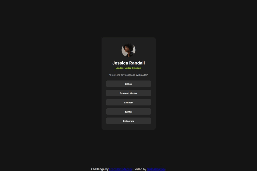
Social links using React and CSS Modules
Design comparison
Solution retrospective
I like how close it seems I got my solution to the design.
I didn't have to split all my components up so much for this project- none of them are re-used. Next time I'd probably just put nearly everything in one components since it's simple enough.
What challenges did you encounter, and how did you overcome them?I had a bit of an issue sticking the footer I made to the bottom of the page while keeping the rest of the content centered on the page. It's something I haven't tried to do before- but the solution was simple- nest the main content inside of a `` tag.
What specific areas of your project would you like help with?If I were to get any suggestions, I would ask suggestions on how I can manage Component styles more effectively.
Nearly always, for bigger projects, I find that I want to re-use some component but the styles I applied to it aren't great for what I want to do. That didn't crop up in this project though.
Community feedback
Please log in to post a comment
Log in with GitHubJoin our Discord community
Join thousands of Frontend Mentor community members taking the challenges, sharing resources, helping each other, and chatting about all things front-end!
Join our Discord
