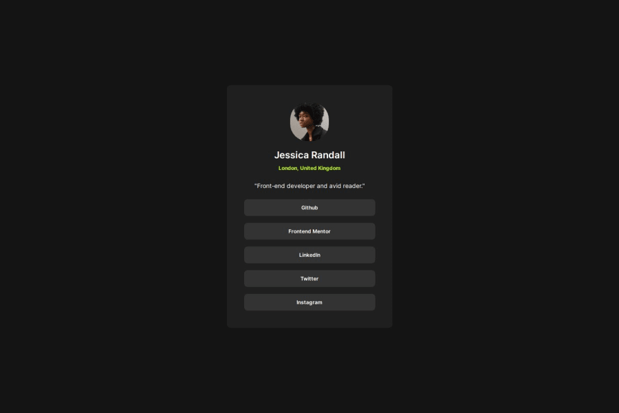
Design comparison
SolutionDesign
Solution retrospective
Is the way that I'm adding margin throughout correct? I'm setting the margin-top to 0px and then adding margin-bottom to space everything.
Community feedback
- @danielmrz-devPosted 9 months ago
Hello @yas-avocad!
There's a best way to separate elements inside the same container:
- Use flex/grid on the parent container and the property
gap.
📌 By doing this, you create an equaly sized space between all the elements inside this container, so you don't need to use
margin-topandmargin-bottomon each of them individually.Example:
.parent-container {
   display: flex;  /*  or grid  */
   flex-direction: column; /*  or row  */
   gap: 10px;  /* this creates a 10px gap between all the elements inside this container */
}
I hope it helps!
0 - Use flex/grid on the parent container and the property
Please log in to post a comment
Log in with GitHubJoin our Discord community
Join thousands of Frontend Mentor community members taking the challenges, sharing resources, helping each other, and chatting about all things front-end!
Join our Discord
