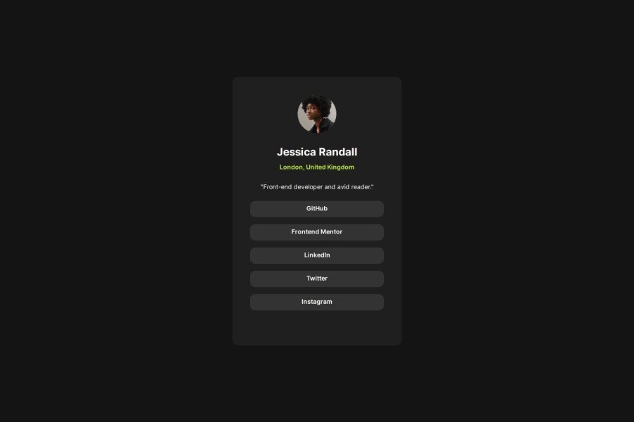
Design comparison
Solution retrospective
-With the previous challenges. My workflow has improved in this challenge.
- I would try to use relative sizing options and use more semantic HTML.
-There were no notable challenges. expect for a few alignment issues
What specific areas of your project would you like help with?- knowing multiple ways to create a responsive design that works in different sizes and devices.
Community feedback
- @DylandeBruijnPosted 5 months ago
Hi @prem-kumart,
Congratulations on a great looking solution! Good that you were able to improve your workflow during this project. You are making a lot of progress.
Do you have any specific questions you need help with?
I checked your solution and have a bit of general friendly constructive feedback:
body { font-family: 'Inter', sans-serif; height: 100%; margin: 0px; background-color: hsl(0, 0%, 8%); display: flex; flex-direction: row; justify-content: center; align-items: center; }
You could remove the
height
andflex-direction: row
here. You already set theheight
here:html, body { height: 100%; }
To prevent overflow issues it's better to use
min-height: 100vh
, so thehtml
andbody
still scale with the content inside it.You don't have to declare
flex-direction: row
because this is already the default value when you putdisplay: flex
on an element.main { height: 611px; width: 384px; background-color: hsl(0, 0%, 12%); border-radius: 12px; }
Try keeping the
height
of your card fluid. At the moment you have a fixed height on the card which will cause overflow issues if the content of the card grows. You can see this when you add a lot of text to the card description for example. Just removing theheight
fixes this because the default value forblock
elements isheight: auto
.You could make your CSS values more reusable by using CSS variables in the future.
I hope you find my feedback valuable, and I would appreciate it greatly if you could mark is as helpful if it did help you out.
Happy coding!
Marked as helpful2@prem-kumartPosted 5 months agoHello Dylan That review was helpful. The solutions are on point. Thank you. @DylandeBruijn
1
Please log in to post a comment
Log in with GitHubJoin our Discord community
Join thousands of Frontend Mentor community members taking the challenges, sharing resources, helping each other, and chatting about all things front-end!
Join our Discord