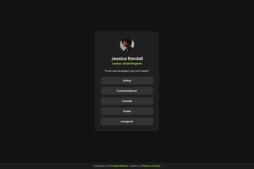
Submitted over 1 year agoA solution to the Social links profile challenge
Social Links using GRID and FLEXBOX
@fedefioretti

Solution retrospective
What are you most proud of, and what would you do differently next time?
Like other projects im proud of the result. And this is the first time that i used the terminal and git comands in the right way without mistakes. Also github
What challenges did you encounter, and how did you overcome them?still figuring out how to use properly CSS, so i've found in chat GPT not only solutions but also, and more importantly, explanations...
What specific areas of your project would you like help with?i'd love to read you guys critics or whatever you want to share with me... I'm a rookie student, so still learning here
Code
Loading...
Please log in to post a comment
Log in with GitHubCommunity feedback
No feedback yet. Be the first to give feedback on Federico Fioretti's solution.
Join our Discord community
Join thousands of Frontend Mentor community members taking the challenges, sharing resources, helping each other, and chatting about all things front-end!
Join our Discord