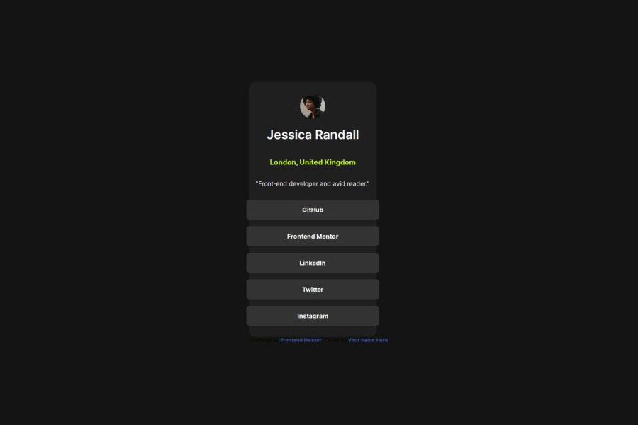
Design comparison
SolutionDesign
Solution retrospective
What are you most proud of, and what would you do differently next time?
positioning everything corretly
What challenges did you encounter, and how did you overcome them?I wansn't struggling with anything
What specific areas of your project would you like help with?nothing I guess but i may be wrong
Community feedback
- P@developer-rubenPosted about 1 year ago
Hi!
Here are my tips:
- Separate css from the html by putting it in a separate file
- Use classnames instead of html tags as selectors (take a look at the BEM method)
- There are no hover states on the buttons
- The card is too small when using vh as a height, the buttons are appearing outside of the card
Best, Ruben
Marked as helpful1@pioDer-vgyPosted about 1 year ago@developer-ruben i have fixed everything and added hover, thanks for suggestions.
0
Please log in to post a comment
Log in with GitHubJoin our Discord community
Join thousands of Frontend Mentor community members taking the challenges, sharing resources, helping each other, and chatting about all things front-end!
Join our Discord
