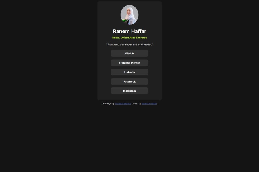
Design comparison
SolutionDesign
Solution retrospective
What are you most proud of, and what would you do differently next time?
I would like to try and make this page with a framework or a front end library.
What challenges did you encounter, and how did you overcome them?I am having trouble still with layout styling in different screen sizes.
What specific areas of your project would you like help with?The layout.
Community feedback
- @marliedevPosted about 2 months ago
Hi Ranem!
Add a display:flex and min-height:100vh to your body, so the card gets vertically centered.
Marked as helpful0@Ranem97Posted about 2 months ago@marliedev I tried that actually but it didn't work so i ended up using align-content: center; and removing the footer section.
1 - @YacoubDweikPosted about 2 months ago
Hey!
When you want to align something in X & Y Planes then just give that thing position: absolute; top: 50%; left: 50%; transform: translate(-50%, -50%); || and remove any unnecessary stuff from the body
1
Please log in to post a comment
Log in with GitHubJoin our Discord community
Join thousands of Frontend Mentor community members taking the challenges, sharing resources, helping each other, and chatting about all things front-end!
Join our Discord
