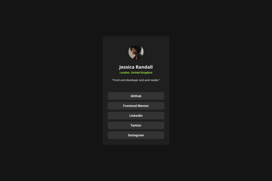
Design comparison
Community feedback
- P@AbestianPosted 4 months ago
Great Job on Your Solution!
First off, I just want to say you did an amazing job with your solution! It's almost identical to the provided design and the hover effect on clickable elements is spot-on.
Since I haven't worked with React yet, I won’t dive into the code. I have some suggestions on the card itself though, and I think they could make your solution even better:
1. Add Margin to Card Sides
When the screen width goes below 355px, the card starts to stick to the sides of the screen. A small margin on the sides would fix this and make the design look cleaner on smaller screens.
2. Smooth Hover Transition on Links
The hover effect on the links is a bit too sudden. Adding a transition delay could smooth it out and give it a more polished feel.
3. Minor Cosmetic Tweaks
These are small details that won't break the functionality but could improve the overall experience:
3.1 Fix Content Shifting with Different Screen Heights
When you stretch the screen vertically, the card content shifts because of
justify-content: space-around. It would be better if the content stayed in place regardless of the screen height.3.2 Text Alignment for Small Screens
When the screen width gets below 200px, the text in the upper part of the card starts to stick to the sides. A quick fix here is to add
text-align: center;to ensure the text stays centeredThese are just a few thoughts to help make your already great solution even better! Keep up the fantastic work!
0
Please log in to post a comment
Log in with GitHubJoin our Discord community
Join thousands of Frontend Mentor community members taking the challenges, sharing resources, helping each other, and chatting about all things front-end!
Join our Discord
