Design comparison
Solution retrospective
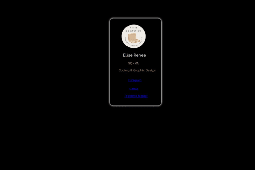
This was fun to do! I customized it to me
What challenges did you encounter, and how did you overcome them?I am getting but at the hover effect!
Community feedback
- @beowulf1958Posted about 1 month ago
Great job completing this challenge. It looks good at 1440px screen size. I loved that you customized it for you; that shows you are creative.
Here are some suggestions to improve. First remember the DRY principle: don't repeat yourself. You declared
font-family: 'Comfortaa';
in three different places. If you set the body element tofont-family: 'Comfortaa';
the cascade will do the rest.It is not a good practice to position everything absolutely. You can, in fact, remove all the position, top, and left styles and the card will look just fine. Just add
gap: 15px;
to the .card style, and the card is good to go.Once the top and left styles are removed, .instagram, .github, and .front classes can be removed and replaced with a single .link class. This will save you some typing, be easier to maintain, and still look great.
In order to center the card, best practice is to use flexbox or grid on the parent element (the body). This article will explain all the details. This will solve the responsiveness problem.
Hope this helps.
0 - @asimsaeed353Posted about 1 month ago
Great design impressive improvisation. You can apply padding on link elements to maximize their width. And apply
text-decoration : none;
and give them colors according to your design.0
Please log in to post a comment
Log in with GitHubJoin our Discord community
Join thousands of Frontend Mentor community members taking the challenges, sharing resources, helping each other, and chatting about all things front-end!
Join our Discord