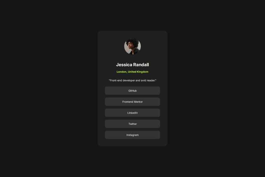


Design comparison

Solution retrospective
i am a bit confused with how the layouts work on different screen sizes and browsers so i use the built in inspection tool to see how the page looks on a 1440 x 960 desktop view and mobile but when i exit the design looks too big on my screen is that how it should be ?
What specific areas of your project would you like help with?i would really like some help with the best practices and tools that proffesionals use when it comes to converting a design to HTML CSS. any feedback on things i can improve on ! thank you
Community feedback
- P@loki-pepePosted 3 months ago
Regarding your concern about different screen sizes, you can use media queries to set designs for various dimensions. I would take a mobile first approach where you set the design for the smallest screen and then upscale as the screens get bigger (for instance small mobile > large mobile > tablet > small desktop > large desktop) and you can even change your design depending on the orientation of the screen (landscape vs portrait).
For a small project like this, I think one or two breakpoints between different screen sizes will be enough (mobile > desktop, and perhaps a tablet in between).
Give one of these links a read (or all of them):
Marked as helpful0

Please log in to post a comment
Log in with GitHub
Join our Discord community
Join thousands of Frontend Mentor community members taking the challenges, sharing resources, helping each other, and chatting about all things front-end!
Join our Discord