

Design comparison

Solution retrospective
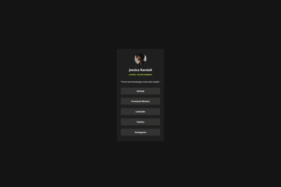
Used Flexbox a lot for this. Really like that it's forcing me to practice it more.
What challenges did you encounter, and how did you overcome them?Spacing, font, and image sizing I had to eyeball since I don't have the pro version with the Figma specifications. It's not exactly right but I think it's close enough.
What specific areas of your project would you like help with?Spacing/font sizing suggestions. Did I use Flexbox correctly? Or are there other ways I could have aligned things that are more elegant?
Community feedback
- @DannyGuerinPosted 2 months ago
Hey Ben. Seeing as you had to eyeball this, it's looking pretty decent. Here are a few things that I noticed:
-
The card looks smaller than the design and the padding around the edges could be a little thicker... Unless you were just focusing on the mobile version, in which case, cool.
-
Check out media queries for your CSS to make the build work on all devices. They are pretty easy to add and will make it look better everywhere.
Hope this helps. :-)
1 -

Please log in to post a comment
Log in with GitHubJoin our Discord community
Join thousands of Frontend Mentor community members taking the challenges, sharing resources, helping each other, and chatting about all things front-end!
Join our Discord