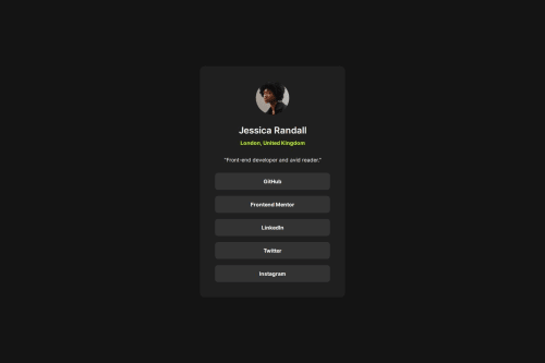
Submitted over 1 year agoA solution to the Social links profile challenge
Social links profile with tailwindcss
tailwind-css
P
@vstm

Solution retrospective
What are you most proud of, and what would you do differently next time?
It's my third solution of the "newbie" path so it was mostly consolidating what I've learned before. Still, I don't yet have a structured process to adapt the style from the design, what I basically did is I roughly went from the outermost to the inner element from top to bottom and styled the spacing (padding, gaps, size where applicable). Then it looked somewhat like the design, and it took me a couple of iterations before I got it right.
Maybe I need kind of a checklist what to look for before moving on.
Code
Loading...
Please log in to post a comment
Log in with GitHubCommunity feedback
No feedback yet. Be the first to give feedback on Stefan Vetsch's solution.
Join our Discord community
Join thousands of Frontend Mentor community members taking the challenges, sharing resources, helping each other, and chatting about all things front-end!
Join our Discord