Not Found
Not Found
Not Found
Not Found
Not Found
Not Found
Not Found
Not Found
Not Found
Not Found
Not Found
Not Found
Not Found
Not Found
Not Found
Not Found
Not Found
Not Found
Not Found
Not Found

Submitted

Social Links Profile (with SCSS & Light Mode)

Levi 90

@law973

Desktop design screenshot for the Social links profile coding challenge

This is a solution for...

  • HTML
  • CSS
1newbie
View challenge

Design comparison


SolutionDesign

Solution retrospective


What are you most proud of, and what would you do differently next time?

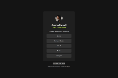
I'm proud of how closely my solution matches the requested design, and of how clamp was implemented to shift the card between its minimum and maximum sizes. (Also, clicking the profile image will toggle a secret "Light Mode" color scheme I included for fun.)

Next time, I would perhaps give more consideration to how the card looks on mobile landscape orientations.

What challenges did you encounter, and how did you overcome them?

I'm not as familiar with using rem units as I should be. I started this challenge using pixel values for everything, but ended up using an online conversion tool to get the rem values that corresponded to the pixel values I wanted to replace.

What specific areas of your project would you like help with?

Regarding semantic HTML, I am wondering if using h2 for the "London, United Kingdom" text was appropriate, if p would have been better, or if it's merely a matter of preference. I also used an unordered list for the card links and am wondering if that was a proper use of that element.

Community feedback

T
Grace 29,310

@grace-snow

Posted

Hi, nice looking solution. Here are some improvements I recommend :

  • this should all be in a main landmark, not a header landmark. That has a banner role and it's purpose is to hold primary content that repeats across a site. There should be no page-specific content in a header.
  • the location isn't appropriate as a heading element, it's just a paragraph. If it was a heading that would make it the title of the content below, which doesn't make sense in this case.
  • if making links open in a new tab (unexpected behaviour) you must warn assistive technology users about this beforehand. Usually that's done with some sr-only text in a span inside the link e.g. "(Opens in a new tab)".
  • I'd expect to see a modern css reset at the start of the styles. Not strictly needed in this project but don't get into the habit of forgetting it.
  • I'm not sure what theme switcher you're referring to in the text above. I can't see that but can see you're linking a js file without any controls on the page so am confused why that's there.

Marked as helpful

2

Levi 90

@law973

Posted

@grace-snow Thanks for the recommendations! I've changed the solution to incorporate these suggestions and will keep the principles in mind for future projects. I didn't use a proper switch for the theme initially, but there's a button for it now.

0

Please log in to post a comment

Log in with GitHub
Discord logo

Join our Discord community

Join thousands of Frontend Mentor community members taking the challenges, sharing resources, helping each other, and chatting about all things front-end!

Join our Discord