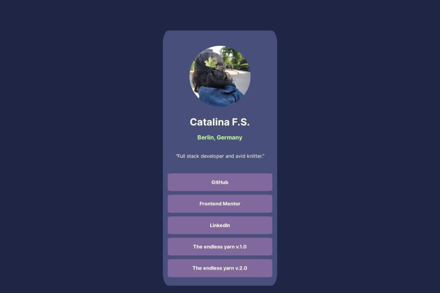
Design comparison
Solution retrospective
I really enjoyed doing this project and as time goes by I am becoming more agile and faster. I loved the styling I chose :)
What challenges did you encounter, and how did you overcome them?Choosing the appropriate and accessible color palette.
What specific areas of your project would you like help with?I hesitated a bit on the responsive design. I think I need to refresh my knowledge on this subject.
Community feedback
- @EugeniaAntonovaPosted 5 months ago
Hi and congradulations on this challenge! I really love the color pallet you`ve chose. A tiny bit of advice:
-
in rectangular shapes with not equal sides, like you have here, it is better to use border-radius given in px, em, rem etc. The result you have got now does not seem planned
-
use transitions for almost anything that changes, especially as significantly as background color in your links. It makes the feel of you UI more natural and frieandly to the eye
-
for margins it is a better choice to use margin property. When creating a document flow it is better to make margins from top to bottom and from left to right. In this way you would have h1 margin--bottom: .5em (for instance), .location margin-bottom: 1em (or just twice as the previous one to create connection between name and location and separate slogan as a thing of its own)
Good luck!
Marked as helpful0@CatalinaF-SPosted 4 months agoThank you @EugeniaAntonova for your useful feedback. I will review my code again and put in practice your advices :)
0@EugeniaAntonovaPosted 4 months ago@CatalinaF-S happy to help! All the best to you and your career!
0 -
Please log in to post a comment
Log in with GitHubJoin our Discord community
Join thousands of Frontend Mentor community members taking the challenges, sharing resources, helping each other, and chatting about all things front-end!
Join our Discord