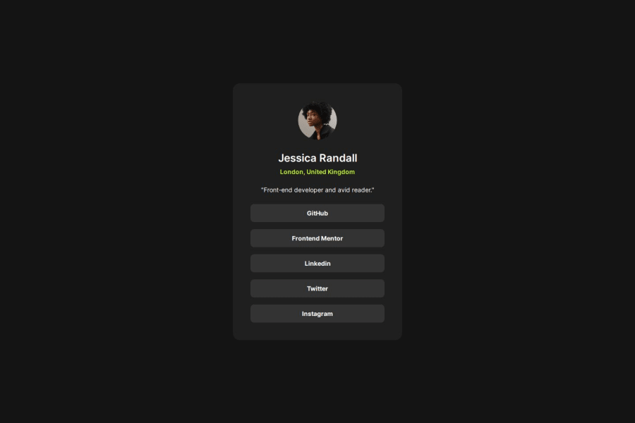
Design comparison
SolutionDesign
Solution retrospective
What are you most proud of, and what would you do differently next time?
This time i maked a function that simulates an API object with the Profile information. I believe that turned my code more easy to understanding and more clean on principal component.
What challenges did you encounter, and how did you overcome them?For now Im confotable with react and css styles. I almost have no difficult to complete this chalange.
What specific areas of your project would you like help with?any advises is very welcome! :)
Community feedback
- @0xabdulkhaliqPosted 7 months ago
Hello there 👋. Congratulations on successfully completing the challenge! 🎉
- I have a suggestion regarding your code that I believe will be of great interest to you.
MAKING ACCESSIBLE LINKS:
- The links like
Github
,Frontend Mentor
are needed to be wrapped up usingli
andul
elements.
- This is the current markup,
<div class="link-container"> <a href="">Github</a> <a href="">Frontend-mentor</a> ... </div>
- Using
ul
andli
elements for navigation links can indeed improve accessibility, as they provide semantic meaning and structure that assistive technologies (such as screen readers) can better understand and navigate.
- By using an unordered list (
ul
) and list items (li
), you provide a more meaningful structure that indicates the links are part of a group or menu. Screen readers and other assistive technologies are designed to interpret and navigate these elements more effectively, making it easier for users with disabilities to understand the content and navigate between the links.
- Here's an example of how you could restructure the code using
ul
andli
:
<ul class="link-container"> <li> <a href="#">Github</a> </li> <li> <a href="#">Frontend Mentor</a> </li> ... </ul>
- In this structure, the
ul
element represents the overall group of links, and each individual link is wrapped in anli
element, indicating that they are part of the same list or menu.
- While it may seem like a minor change, using the appropriate semantic elements for navigation and menu structures can significantly improve accessibility and usability for users with disabilities or those who rely on assistive technologies.
- If you have any questions or need further clarification feel free to reach out to me.
.
I hope you find this helpful 😄 Above all, the solution you submitted is great !
Happy coding!
Marked as helpful1
Please log in to post a comment
Log in with GitHubJoin our Discord community
Join thousands of Frontend Mentor community members taking the challenges, sharing resources, helping each other, and chatting about all things front-end!
Join our Discord