Submitted 7 months ago
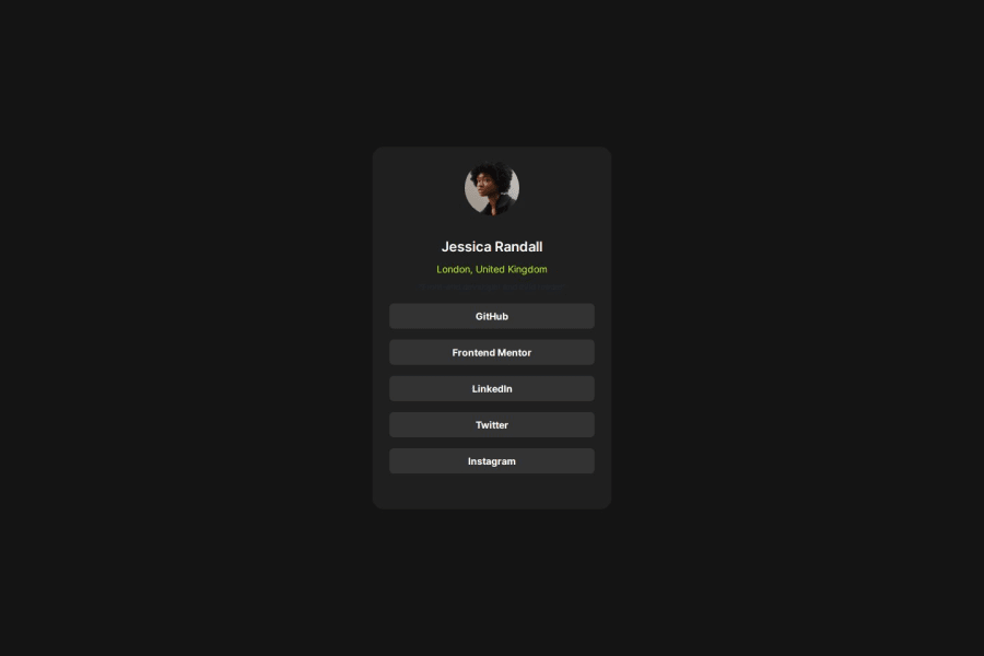
Social Links Profile with React JS
#react#vite#tailwind-css
@RappyProg
Design comparison
SolutionDesign
Solution retrospective
What are you most proud of, and what would you do differently next time?
On this project, i was able to do it with much faster timing compared to the previous one. Despite it being quite similar with the previous project, i believe this is a good progress for myself
What challenges did you encounter, and how did you overcome them?I'm still having challenges with determining width. I was suggested to use figma so i tried using one, however after looking at the resolution, it doesnt feel right to me, so i use my own resolutions
What specific areas of your project would you like help with?I would love feedbacks especially some help on determining widths of something. Because it would help me to be more accurate
Community feedback
Please log in to post a comment
Log in with GitHubJoin our Discord community
Join thousands of Frontend Mentor community members taking the challenges, sharing resources, helping each other, and chatting about all things front-end!
Join our Discord
