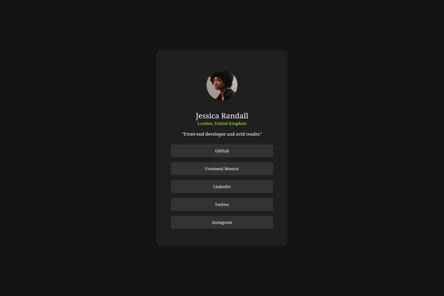


Design comparison

Solution retrospective
Without Design files It was so hard to find, spacing, font size, font weight and make the solution look like the design.
What challenges did you encounter, and how did you overcome them?Without Design files, it was hard to find spacing, font size, and font weight and make the solution look like the design.
I tried my best to make it look similar.
What specific areas of your project would you like help with?How do I get better at putting elements together with correct spacing among them?
Community feedback
- @feelgoodddPosted about 2 months ago
Since you are using flex you can add the gap property which will add a gap between each flex item. Research flex gap and you'll see. for example gap: 1rem; will add a gap between each flex item of 1rem and gap: space-between; would evenly space out your flex items with the same spacing between each one.
Alternatively you can use margin-bottom to add a space to the bottom of an element to give it some space. Sometimes margin is better than gap, or even necessary such as when not using flex or grid.
Also in your media query you added a set height of your container causing your elements to spill out of your container if you look at the site on a cell phone you'll see the layout is completely ruined.
Finally your github repo leads to a 404 page so we can not view your source code easily. Please make sure the link is correct, and that the repository is public and not private.
Marked as helpful0

Please log in to post a comment
Log in with GitHubJoin our Discord community
Join thousands of Frontend Mentor community members taking the challenges, sharing resources, helping each other, and chatting about all things front-end!
Join our Discord