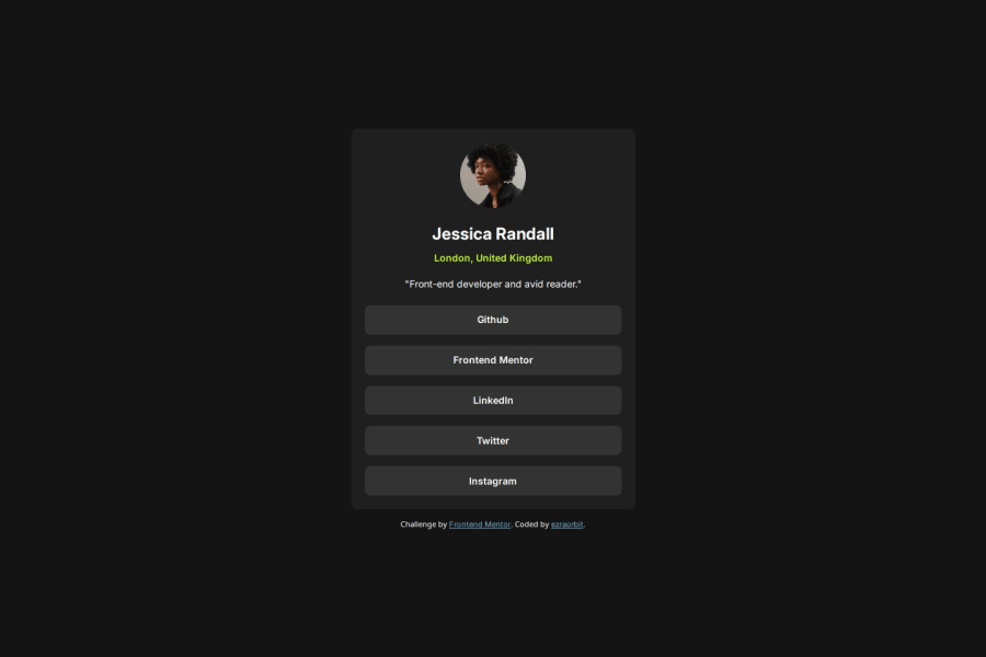
Design comparison
Solution retrospective
Centering the card in the middle of the page. I managed to find a solution on Stack Overflow that used position and translation styles.
What specific areas of your project would you like help with?How can I make my CSS better.
Community feedback
- @MikDra1Posted 2 months ago
If you want to make your card responsive with ease you can use this technique:
.card { width: 90%; max-width: 37.5rem; }
On the smaller screens card will be 90% of the parent (here body), but as soon as the card will be 37.5rem (600px) it will lock with this size.
Also to put the card in the center I advise you to use this code snippet:
.container { display: grid; place-items: center; }
Hope you found this comment helpful 💗💗💗
Good job and keep going 😁😊😉
Marked as helpful0 - @StroudyPosted 2 months ago
-
Wrapping the image in a
<div>
on its own is unnecessary<div class="profile-img"><img src="./assets/images/avatar-jessica.jpeg" alt=""></div>
, -
Having a clear and descriptive
alt
text for images is important because it helps people who use screen readers understand the content, making your site more accessible. It also improves SEO, as search engines usealt
text to understand the image's context, helping your site rank better, Check this out Write helpful Alt Text to describe images, -
On your
.card
you should have yourmax-width: 375px;
set in rem aswell to be consistent with the rest of your code, -
Developers should avoid using pixels (
px
) because they are a fixed size and don't scale well on different devices. Instead, userem
orem
, which are relative units that adjust based on user settings, making your design more flexible, responsive, and accessible. For more information check out this, Why font-size must NEVER be in pixels or this video by Kevin Powell CSS em and rem explained.- Another great resource for px to rem converter. -
Using
position: absolute
is not always best practice because it removes elements from the normal document flow, making layouts harder to manage and potentially causing overlap or misalignment on different screen sizes. Instead, use flexible layout techniques like CSS Grid or Flexbox for more responsive and maintainable designs.
You’re doing fantastic! I hope these tips help you as you continue your coding journey. Stay curious and keep experimenting—every challenge is an opportunity to learn. Have fun, and keep coding with confidence! 🌟
Marked as helpful0 -
Please log in to post a comment
Log in with GitHubJoin our Discord community
Join thousands of Frontend Mentor community members taking the challenges, sharing resources, helping each other, and chatting about all things front-end!
Join our Discord