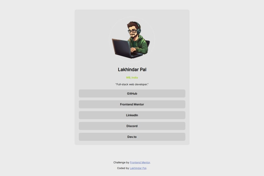
Not Found
Not Found
Not Found
Not Found
Not Found
Not Found
Not Found
Not Found
Not Found
Not Found
Not Found
Not Found
Not Found
Not Found
Not Found
Not Found
Not Found
Not Found
Not Found
Not Found

Submitted

Social Links Profile with Light & Dark Mode

Lakhindar Palβ€’ 60

@LakhindarPal

Desktop design screenshot for the Social links profile coding challenge

This is a solution for...

  • HTML
  • CSS
1newbie
View challenge

Design comparison


SolutionDesign

Solution retrospective


  1. Thoughts on the webpage's design and layout in light mode?
  2. Suggestions for improving accessibility or user experience?
  3. Areas of code needing optimization or refactoring?
  4. Feedback on hover and focus states for interactive elements?
  5. Additional tools or techniques to enhance functionality or aesthetics?

Community feedback

Olaniyi Ezekielβ€’ 7,560

@Ezekiel225

Posted

Hello there πŸ‘‹ @LakhindarPal.

Good job on completing the challenge !

Your project looks really good!

I have a suggestion about your code that might interest you.

There is an very useful browser extension called Perfect Pixel that allow you compare with the design image and thus see the exact dimensions. I recommend it to you.

Consider adding a min-height of 100vh to the body element so as to centralize your project.

body { 
  min-height: 100vh;
  align-items: center;
  display: flex;
  justify-content: center;
}

Learn more about Media Queries: Media queries are an essential part of responsive web design. They allow you to apply different CSS styles based on the characteristics of the device, such as screen width, height, orientation, and resolution. You can start by reading articles or tutorials on media queries to understand how they work and how to use them effectively.

Practice: The best way to become familiar with media queries is to practice using them in your projects. Start with simple layouts and gradually increase complexity as you gain confidence. Experiment with different breakpoints and CSS rules to see how they affect the layout on various devices.

Use a Mobile-First Approach: One popular strategy for responsive design is the mobile-first approach. This means designing the layout for mobile devices first and then adding styles for larger screens using media queries. This approach helps ensure that your website looks good on small screens and then adapts to larger screens.

I hope this suggestion is useful for future projects.

Keep up the excellent work and continue to challenge yourself with new projects. Your progress is impressive, and each project is a step forward in your front-end development journey! πŸš€πŸŒŸ.

Other than that, great job!

Happy coding.

1
Daniel πŸ›Έβ€’ 44,210

@danielmrz-dev

Posted

Hello @LakhindarPal!

Your solution looks excelent!

I have just one suggestion:

πŸ“Œ Consider this tweak for your HTML code:

To improve semantic clarity, try maintain the titles hierarchy with <h1>, <h2> <h3>, and so on.

It's more than just text size β€” it's about structuring your content effectively:

  • <h1> to <h6> are used to define HTML headings, with <h1> being the most significant.
  • And stick to one <h1> per page for the main title.

While these adjustments might not alter the visual appearance much, they significantly enhance semantic clarity, SEO optimization, and accessibility.

Hope this suggestion proves helpful! Keep up the great work!

0

Lakhindar Palβ€’ 60

@LakhindarPal

Posted

@danielmrz-dev Thank you for your kind words and valuable suggestion!

I appreciate your feedback and will definitely consider maintaining a clearer hierarchy with <h1>, <h2>, <h3>, etc., for the titles in my HTML code. Ensuring semantic clarity not only improves the structure of the content but also enhances SEO optimization and accessibility. I'll make the necessary adjustments to ensure the best possible user experience.

Thanks again for your insightful suggestion and encouragement!

0

Please log in to post a comment

Log in with GitHub
Discord logo

Join our Discord community

Join thousands of Frontend Mentor community members taking the challenges, sharing resources, helping each other, and chatting about all things front-end!

Join our Discord