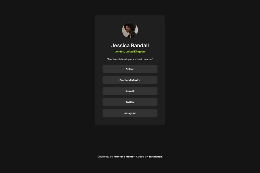
Social links profile with HTML CSS(grid,flexbox, custom properties)
Design comparison
Solution retrospective
I used ul and li in HTML. It wasn't new to me, but it was nice to recall and use the knowledge I had learned
What challenges did you encounter, and how did you overcome them?It wasn't a very challenging project. For me, it was like reviewing all my knowledge. I practiced and became more familiar with Figma
Community feedback
- @kamkwamba-kPosted 5 months ago
Great job on the social links profile card project! The overall design looks good, and you've done a commendable job with the hover effects and responsive layout.
To align the card at the center as the design specification you could also wrap the whole card in a div, give it a class of container and style it as follows:
.container { display: flex; justify-content: center; align-items: center; width: 100%; height: 100vh; }
That way you'll center the whole card
Marked as helpful0@tunaertenPosted 5 months ago@kingsley2o18 Thank you for the tip. Yes, instead of giving flex to the body, I could have placed it inside a container and given flex to the container. Honestly, I do it that way in some cases. Do you think there is any drawback to giving flex to the body?
0@kamkwamba-kPosted 5 months ago@tunaerten I think because the body contains a lot of child elements it can be very tricky to follow up. but it depends on the kind of layout you are implementing.
Marked as helpful0
Please log in to post a comment
Log in with GitHubJoin our Discord community
Join thousands of Frontend Mentor community members taking the challenges, sharing resources, helping each other, and chatting about all things front-end!
Join our Discord