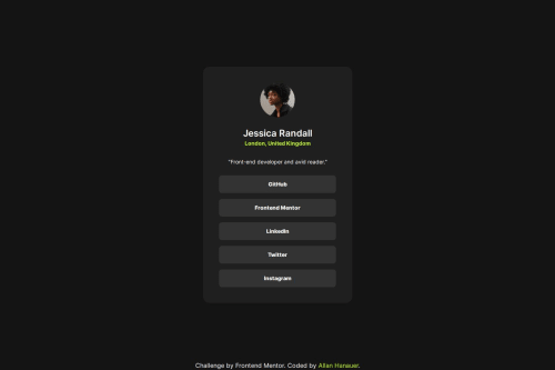
Social Links Profile with HTML and Tailwind CSS

Solution retrospective
Hi there,
I recently completed the Frontend Mentor Social Media Links project using HTML and Tailwind CSS. While I found the experience rewarding, I'm looking for some guidance on how to further leverage this technology. Here are a few areas where I'd appreciate some tips:
Optimizing Workflow: I noticed that Tailwind CSS significantly speeds up the styling process, but I'm curious about any additional tools or techniques that could further streamline my workflow. Are there any VS Code extensions or Tailwind-specific utilities that you recommend incorporating into my development process?
Responsive Design Best Practices: Although I achieved basic responsiveness in my project, I'm keen to learn more about advanced techniques for creating seamless experiences across various devices and screen sizes. Do you have any tips or resources for mastering responsive design with Tailwind CSS?
Customization and Theming: While Tailwind CSS provides a wide range of utility classes, I'm interested in exploring how to customize and extend its default styles to match specific design requirements. Are there any resources or tutorials you suggest for diving deeper into Tailwind's customization capabilities?
Optimization for Production: As I prepare to deploy my projects, I want to ensure that they are optimized for performance. Are there any best practices or tools for optimizing Tailwind CSS code and reducing bundle size in production environments?
Any advice or insights you can provide on these topics would be greatly appreciated. Thank you in advance for your help!
Best regards, Allan Hanauer
Please log in to post a comment
Log in with GitHubCommunity feedback
No feedback yet. Be the first to give feedback on Allan Hanauer's solution.
Join our Discord community
Join thousands of Frontend Mentor community members taking the challenges, sharing resources, helping each other, and chatting about all things front-end!
Join our Discord