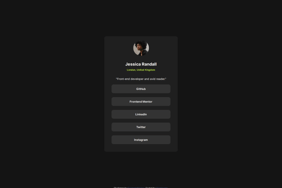
Design comparison
Solution retrospective
I learned how to use Sematic html and the fact that I was able to finish this project within 3 hours
What challenges did you encounter, and how did you overcome them?n/a
What specific areas of your project would you like help with?I would like help on how to change the cursor color to black.
Community feedback
- @danielmrz-devPosted 5 months ago
Hello there!
Congrats on completing the challenge! ✅
Your solution looks excelent!
I have just one suggestion:
📌 To improve semantic clarity, try to maintain the titles hierarchy with
<h1>,<h2><h3>, and so on.It's more than just text size — it's about structuring your content effectively:
<h1>to<h6>are used to define HTML headings, with<h1>being the most significant.
While these adjustments might not alter the visual appearance much, they significantly enhance semantic clarity, SEO optimization, and accessibility.
Hope this suggestion proves helpful! Keep up the great work!
Marked as helpful0
Please log in to post a comment
Log in with GitHubJoin our Discord community
Join thousands of Frontend Mentor community members taking the challenges, sharing resources, helping each other, and chatting about all things front-end!
Join our Discord
