

Design comparison
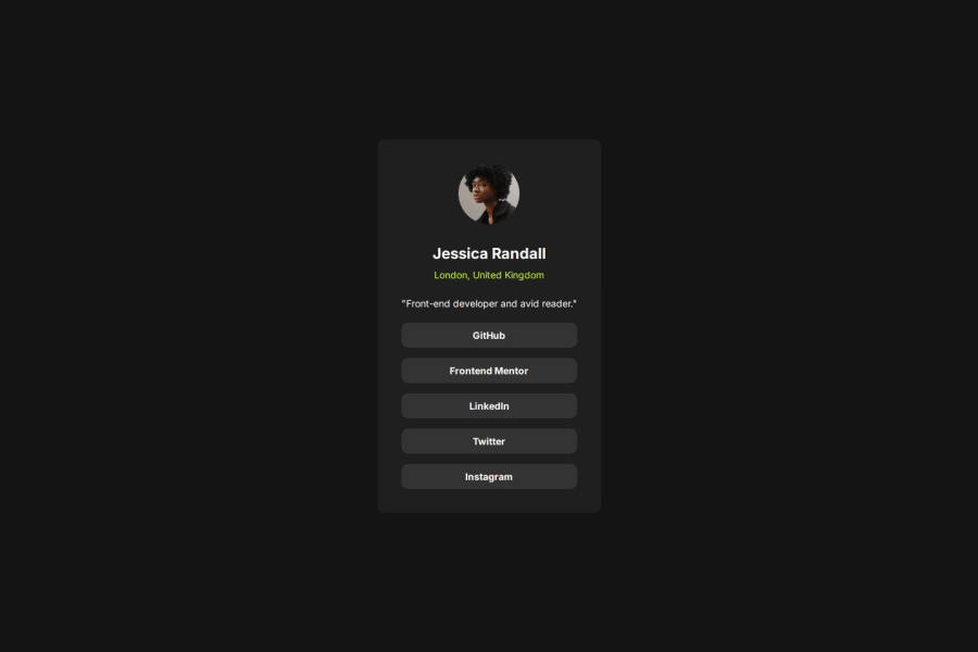
SolutionDesign

Community feedback
- P@mci3xPosted 20 days ago
Looks really good!
If I had to redo it, I would probably went with your way of using flex.
Don't know if you used figma files but there is a different padding on mobile version and also slightly different size of a card.
1@AllanKyleVPosted 20 days ago@mci3x Thank you for the feedback!
I actually had trouble determining the correct sizes, margins, and padding to match the preview challenge. And no, I don't have access to use figma files.
1

Please log in to post a comment
Log in with GitHubJoin our Discord community
Join thousands of Frontend Mentor community members taking the challenges, sharing resources, helping each other, and chatting about all things front-end!
Join our Discord