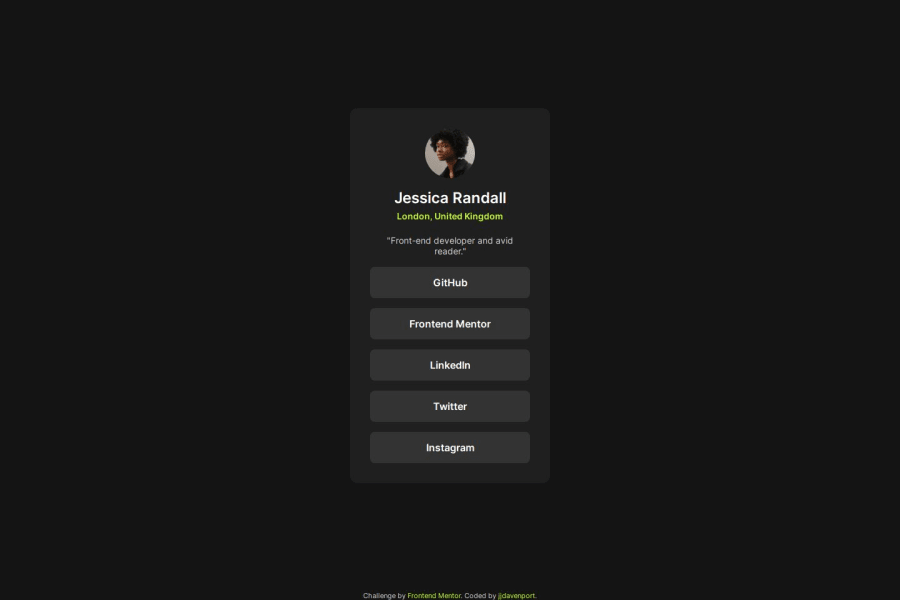
Design comparison
Solution retrospective
I would use Flexbox for this layout, I would probably avoid using Grid for my ul next time.
What challenges did you encounter, and how did you overcome them?Main challenge was overflow with mobile devices.
What specific areas of your project would you like help with?Making a responsive site that works with all devices.
Community feedback
- @BuraYuPosted 9 months ago
Hey Jordan,
your project looks good!
These would be my suggestions:
-Images should be in the HTML not in the CSS (only background images). This way you could add alt text
-In the CSS, you could add a <generic-name> to the font family. A fallback in case the main font doesn't work.
-all the HTML elements are at the beginning of the row. This makes the code harder to read.
All in all looks very good!
Marked as helpful1@jjdavenportPosted 9 months ago@BuraYu thanks for your feedback, can you elaborate further regarding the html elements being at the beginning of the row?
1@BuraYuPosted 9 months ago@jjdavenport
Sure. The indentation in the index.html is off. Each nested element should be indented with the parrent.
You can check this article: https://courses.cs.washington.edu/courses/cse154/17au/styleguide/html-css/spacing-indentation-html.html#:~:text=Spacing%20and%20indentation%20should%20be,inside%20of%20its%20parent%20tag.&text=Place%20a%20line%20break%20after%20every%20block%20element.
Marked as helpful1
Please log in to post a comment
Log in with GitHubJoin our Discord community
Join thousands of Frontend Mentor community members taking the challenges, sharing resources, helping each other, and chatting about all things front-end!
Join our Discord
