Social links profile with flexbox, some custom properties and resets


Design comparison

Solution retrospective
I'm most proud of making good use of resets to help the layout work in a more straightforward manner. Most of my code writing actually did what I wanted it to with less fiddling required.
Next time I will organize my styles in advance and I will commit more frequently to my github.
What challenges did you encounter, and how did you overcome them?My CSS was getting longer and hard to navigate so I used more comments to mark sections.
What specific areas of your project would you like help with?How do I use landmark elements for accessibility in a simple component like this?
Community feedback
- @R3ygoskiPosted 11 months ago
Hello @fish-ladder, congratulations on your project! It looks identical to the proposed design, my sincere congratulations.
Regarding the
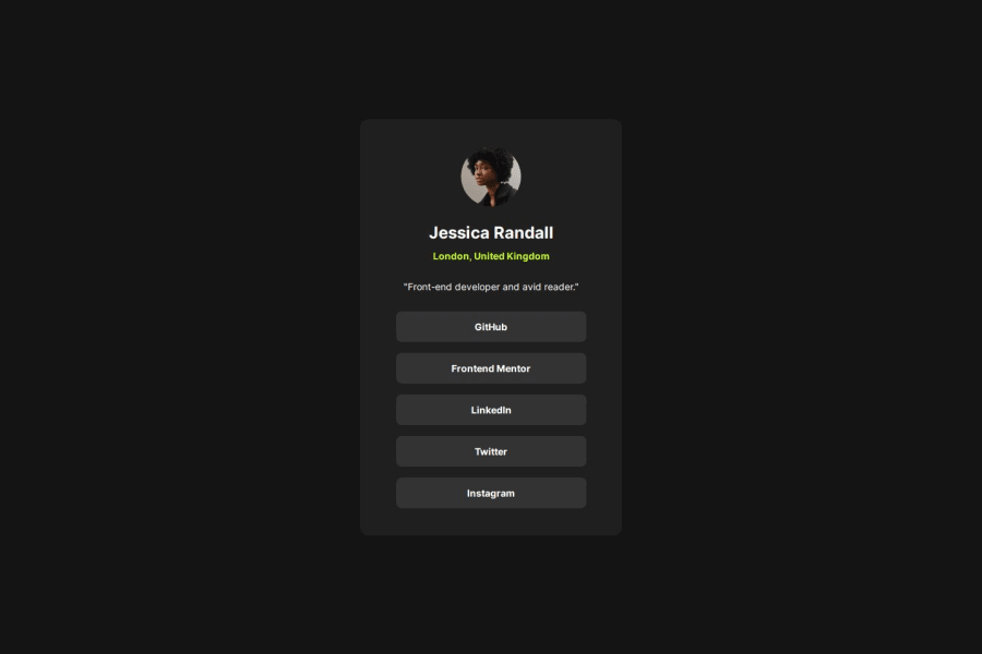
landmarkpart, you can use some elements of semantic HTML, like those from this link: W3School - Accessibility Landmarks. Each one will have a specific meaning. In your project, for example:<div id="name-location">could be a<section>, because<section>is used to store similar thematic content. In your case, it could be the person's data.<h2>London, United Kingdom</h2>here it would be more correct to use<address>, which is used to indicate an address.<nav id="links">and here it would be more correct to use a<ul>and<li>, because even though they are navigation links, they are for the external part of your page, while<nav>is dedicated to internal page navigation.
To make it more semantic, you could also place your
<p id="bio">"Front-end developer and avid reader."</p>inside<div id="name-location">. This way, the idea of<section>would make more sense.Once again, congratulations! If you have any questions, please comment below, and I'll try to help as best as I can!
Marked as helpful0P@fish-ladderPosted 11 months ago@R3ygoski
Thanks a lot, Bernardo. That is exactly the kind of information I can use.
If you are willing, could you glance at my CSS and tell me if I have over-complicated my code? It seems other users who have done this challenge have way fewer lines of code to achieve a similar result. Perhaps I didn't need to define things so exactly (like specific width/height). I sized the elements based off the Figma files to be precise but I wonder if it was not really necessary.
Really appreciate the help,
Joe
1@R3ygoskiPosted 11 months agoHello Joe,
No problem, always happy to help other developers.
Regarding your CSS, I honestly didn't find it too cluttered, it's well organized, and the comments help a lot with navigation.
The only suggestion I would make is instead of using
marginon all sides of the blocks, like the text, image, and button container, you could usealign-items: center;on your selectormain. This way, you would align all of them to the center. Then you can add vertical spacing between them with margin.If you have any questions, you know just comment below.
Marked as helpful0P@fish-ladderPosted 11 months ago@R3ygoski
I will try that! Really appreciate your time,
Joe
1 - @MellTinsPosted 11 months ago
I thought it was perfect, the organization of your code is very good and elegant.
0


Please log in to post a comment
Log in with GitHubJoin our Discord community
Join thousands of Frontend Mentor community members taking the challenges, sharing resources, helping each other, and chatting about all things front-end!
Join our Discord