Design comparison
SolutionDesign
Solution retrospective
What are you most proud of, and what would you do differently next time?
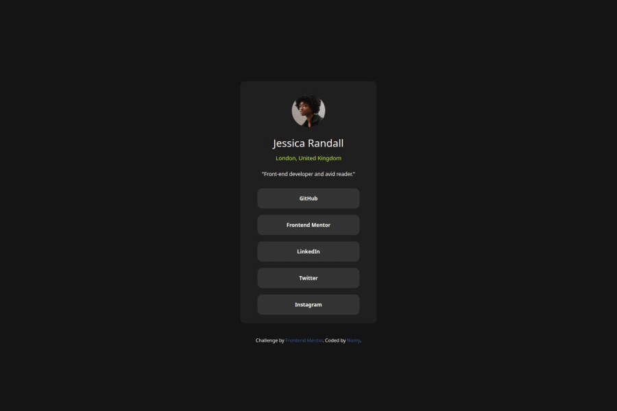
I'm proud of my result; I think it answers the challenge fairly accurately, but I don't believe the solution is wide enough.
What challenges did you encounter, and how did you overcome them?I'm having difficulty figuring out how to set the width that I want while maintaining the responsiveness of the page.
What specific areas of your project would you like help with?I would love some help on this point. Thanks to anyone who has any feedback.
Please log in to post a comment
Log in with GitHubCommunity feedback
- @rembiszkacper
for me it seems to be okay
note that only the text is clickable, not the entire li field
Marked as helpful
Join our Discord community
Join thousands of Frontend Mentor community members taking the challenges, sharing resources, helping each other, and chatting about all things front-end!
Join our Discord
