Social-Links Profile with Flexbox and Grid Layout


Design comparison

Solution retrospective
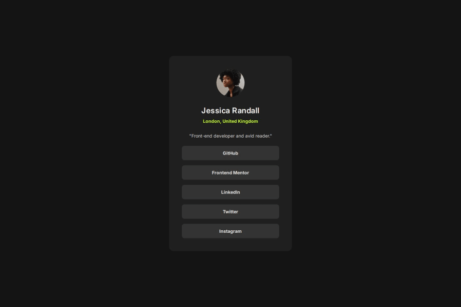
Social-links profile is made as a card inside an article element. I have used two divs inside the article to style and center the social-links profile card.
On the card div I have applied flexbox to center the container div. And on the container div I have applied grid layout. (Note: I checked if I can interchange the application of the two layouts, and I also checked if I could use only one layout on both divs either flexbox or grid layout to see if it has any impact. As I did not notice any difference, I chose to apply both flexbox and css grid.)
I have used width and max-width to control the width of the container div. I have also used calc on both inline and block padding on the container to increase the padding on bigger screen (Could i do this differently? What would be the best practice here?).
I have used media queries on the screen-sizes between 48em and 62em to replicate the design style. Between these sizes I have increased the width, inline and block padding on the container div.
What challenges did you encounter, and how did you overcome them?Calc() on inline and block padding of the container, could I increase the padding in any other way for bigger screen sizes?
What specific areas of your project would you like help with?How could I improve my solution? How do I increase padding on bigger screen sizes? I have applied calc() on this solution.
Please log in to post a comment
Log in with GitHubCommunity feedback
No feedback yet. Be the first to give feedback on cookie-monster01's solution.
Join our Discord community
Join thousands of Frontend Mentor community members taking the challenges, sharing resources, helping each other, and chatting about all things front-end!
Join our Discord