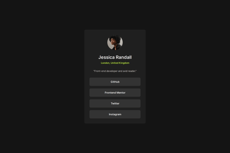
Design comparison
Solution retrospective
It was my first time doing a challenge that didn't come with the Figma file, so I had to use my eyes and guesstimate things. I think I got pretty close, but it would be nice in the future to maybe set things up where I can compare the provided image and my page more easily than just alternating between two windows.
What challenges did you encounter, and how did you overcome them?At one point it seemed my media queries weren't working properly; then I realized it worked when I put them at the end of the file. I didn't realize that media queries didn't increase specificity, so I'll have to keep that in mind in the future when overriding propertie with them.
What specific areas of your project would you like help with?I can't think of specific questions with this particular challenge, but I appreciate any feedback.
Community feedback
Please log in to post a comment
Log in with GitHubJoin our Discord community
Join thousands of Frontend Mentor community members taking the challenges, sharing resources, helping each other, and chatting about all things front-end!
Join our Discord
