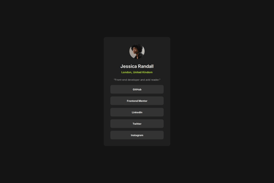


Design comparison

Solution retrospective
I didn't find anything difficult. But I think my font sizes and margins aren't perfect.
Community feedback
- @ProfessoraBiancaPosted 23 days ago
Hey, Dorm! Your solution is really good!
I noticed that you didn't include the cursor color change effect when we hover the links. Why? Did you choose to not include it? Or it was hard to implement?
Anyway, I really liked your design!
0@Dorm-24Posted 23 days ago@ProfessoraBianca Thanks! For the hover effect, I did include it. You should check again.
0@ProfessoraBiancaPosted 23 days ago@Dorm-24 Hmmm... I guess I didn't explained it right.. hahahah Let me try again.
So, for the hover effects in the challenge, there where 2 of them:
1- Make the link background turn green.
2- Change the color of the cursor(pointer) to black.
It's the second one that I'm talking about! When I was doing this challenge it was a very painfull job to do it.. hahahah I'm searching for tips and tricks about that also :D
1@Dorm-24Posted 22 days ago@ProfessoraBianca I didn't even know you can do that! Can you tell me how you did it, because honestly I have no idea how to do it.
0@ProfessoraBiancaPosted 22 days ago@Dorm-24 I don't know if this is the right way, but my code is:
a:hover { background-color: hsl(75, 94%, 57%); color: black; cursor: url('/images/icons8-hand-cursor-32.png') , pointer; }0@Dorm-24Posted 21 days ago@ProfessoraBianca I personally don't think it is needed to change the cursor color, but it's a good practice to try it.
0

Please log in to post a comment
Log in with GitHubJoin our Discord community
Join thousands of Frontend Mentor community members taking the challenges, sharing resources, helping each other, and chatting about all things front-end!
Join our Discord