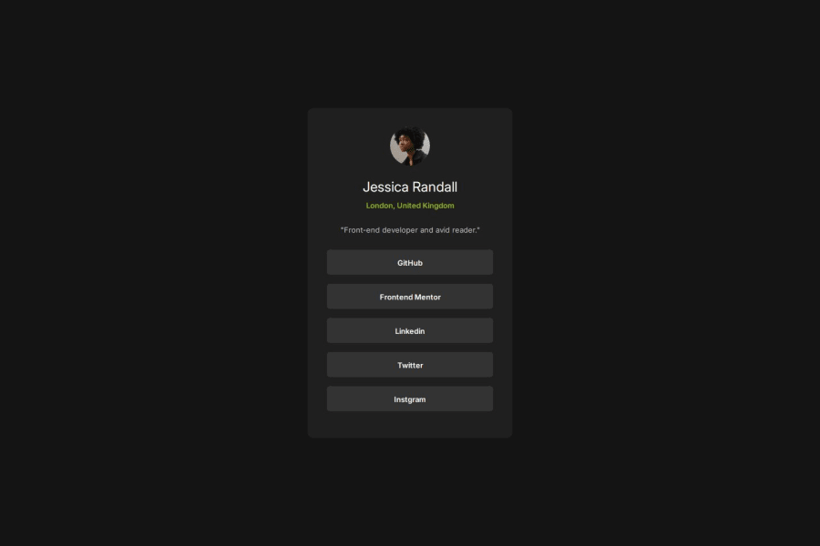
Design comparison
SolutionDesign
Solution retrospective
What are you most proud of, and what would you do differently next time?
i used bootstrap grid.
What challenges did you encounter, and how did you overcome them?after combining custom styling with Bootstrap’s layout system in a structured manner, my design renderd as i expected.
Community feedback
- @mehrnaz98Posted 6 months ago
Great job! The card looks good overall. However, for a better match with the design given, consider changing the hover color of the buttons to a yellowish shade as shown in the design picture. Keep up the great work!
0
Please log in to post a comment
Log in with GitHubJoin our Discord community
Join thousands of Frontend Mentor community members taking the challenges, sharing resources, helping each other, and chatting about all things front-end!
Join our Discord
