

Design comparison

Solution retrospective
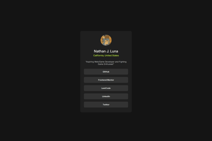
I am most proud of the :hover interaction I made with the background color and text color.
If I were to create things differently, I would've tried to make the card container slightly smaller, because my solution looks slightly larger than the target design.
What challenges did you encounter, and how did you overcome them?I initially used a tag, however I was having a bit of trouble trying to make the button fill up the entire row in the container. There may definitely been a solution to that, but instead used a that would be inside of an tag that would represent the button.
What specific areas of your project would you like help with?I haven't practiced much pseudo-classes, hence why I was proud of using the :hover class for my buttons. I am also wondering how I can make the button take up on entire row, if I didn't need to use a div.
Community feedback
- @AdrianoEscarabotePosted 4 months ago
Hi SunnyFGC, how’s everything? I think your project turned out great! However, I have some feedback that I think might be useful:
To improve the semantics and accessibility of your code, consider using the
<ul>(unordered list) element to group related links. The<ul>tag is ideal for representing collections, such as a list of social media links or navigation items.Using
<ul>not only makes your code more structured and meaningful, but it also helps assistive technologies identify the group as a related set of items, enhancing the experience for screen reader users. Additionally, this approach improves overall readability and maintainability of your HTML.Example:
<ul>
  <li><a href="#">GitHub</a></li>
  <li><a href="#">Frontend Mentor</a></li>
  <li><a href="#">LinkedIn</a></li>
  <li><a href="#">Twitter</a></li>
  <li><a href="#">Instagram</a></li>
</ul>
In this example:
- The <ul> wraps the entire group, indicating that these links are related.
- Each item is enclosed in a <li> (list item), which provides a clear structure and logical grouping.
This method is particularly useful for navigation menus, social media links, or any set of grouped items, offering better support for both SEO and screen readers.
Pro Tip: Avoid using
<div>elements alone for lists, as they don’t convey the same semantic meaning. Whenever possible, choose semantic tags like<ul>or<ol>to improve the quality of your code.The rest is amazing.
I hope this is helpful. 👍
Marked as helpful1


Please log in to post a comment
Log in with GitHubJoin our Discord community
Join thousands of Frontend Mentor community members taking the challenges, sharing resources, helping each other, and chatting about all things front-end!
Join our Discord