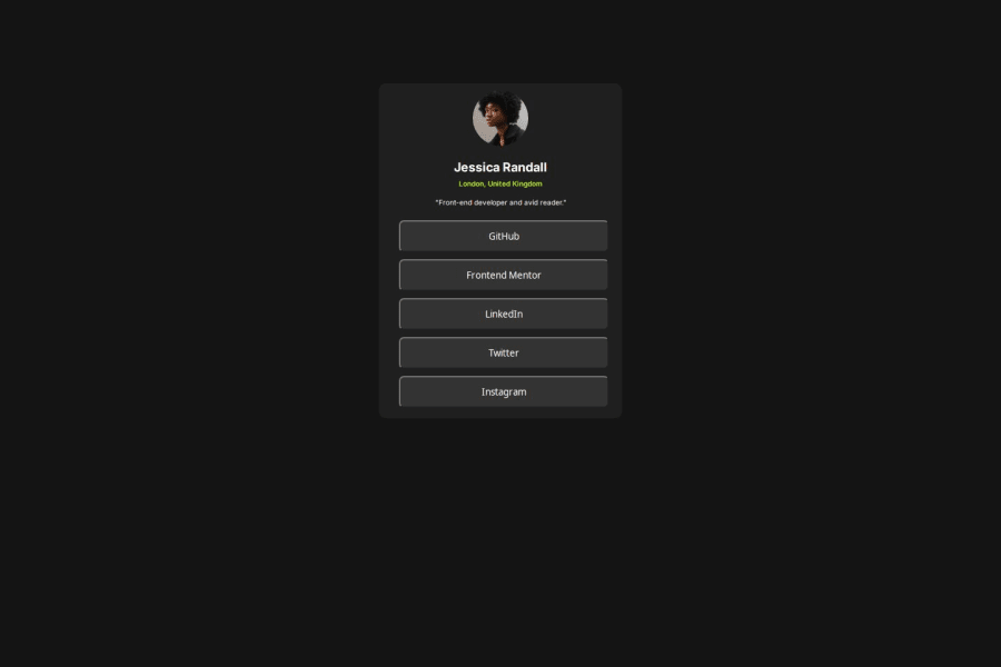
Not Found
Not Found
Not Found
Not Found
Not Found
Not Found
Not Found
Not Found
Not Found
Not Found
Not Found
Not Found
Not Found
Not Found
Not Found
Not Found
Not Found
Not Found
Not Found
Not Found

Submitted

Social Links Profile

@muiruri3000

Desktop design screenshot for the Social links profile coding challenge

This is a solution for...

  • HTML
  • CSS
1newbie
View challenge

Design comparison


SolutionDesign

Solution retrospective


What are you most proud of, and what would you do differently next time?

one more project done.

What challenges did you encounter, and how did you overcome them?

hover button and change the color of text to black without hovering on the anchor tag itself. solved by .buttons button:hover a{ color: black}

What specific areas of your project would you like help with?

my live page is not connecting to the css file. help

Community feedback

P
Steven Stroud 4,100

@Stroudy

Posted

Amazing job with this! You’re making fantastic progress. Here are some small tweaks that might take your solution to the next level…

  • I would put these into a <ul> <li>, and the text should be wrapped with a <a> so it is accessible with a keyboard using the tab key, Using an <a> tag for navigation is semantically correct, improves accessibility for screen readers, and ensures consistent behavior across browsers, unlike a <button> or a <div> not intended for links.
 <div class="buttons">
  <a href="#"><button type="button">  GitHub</button></a> 
  <a href="#"><button type="button">  Frontend Mentor   </button></a>
  <a href="#"><button type="button">   LinkedIn  </button></a>
  <a href="#"><button type="button">   Twitter  </button></a>
  <a href="#"><button type="button">   Instagram  </button></a>
</div>
  • Developers should avoid using pixels (px) because they are a fixed size and don't scale well on different devices. Instead, use rem or em, which are relative units that adjust based on user settings, making your design more flexible, responsive, and accessible. For more information check out this, Why font-size must NEVER be in pixels or this video by Kevin Powell CSS em and rem explained.- Another great resource for px to rem converter.

  • For future project, You could downloading and host your own fonts using @font-face improves website performance by reducing external requests, provides more control over font usage, ensures consistency across browsers, enhances offline availability, and avoids potential issues if third-party font services become unavailable.

  • Using rem or em units in @media queries is better than px because they are relative units that adapt to user settings, like their preferred font size. This makes your design more responsive and accessible, ensuring it looks good on different devices and respects user preferences.

Great job taking the time to learn! Your efforts are paying off, and I hope these insights guide you to even more success. Keep pushing forward, and remember, you’ve got this! Enjoy your coding adventures! 💪

Marked as helpful

0

@muiruri3000

Posted

Thanks a lot@Stroudy for your encouragement. Will sure take in those corrections.

Am also having trouble making images visible on live site, am forced to use the absolute references. How do I go about this?

1
P
Steven Stroud 4,100

@Stroudy

Posted

@muiruri3000, Hey, No problem, try to add the image in HTML with the <img> tag like this <img src="./" alt="">, If you put the ./ in the src you can go to images and select the image. There are many benefits to loading it in HTML over CSS. After you have done that you can style it with this code snippet,

  width: 100%;
  height: auto;
  max-width: 5.5rem;
  border-radius: 50%;

Hope this was helpful, I would like to know if this was successful, Good luck!

0

@SvitlanaSuslenkova

Posted

<link rel="stylesheet" href="/assets/css/style.css"> ?

try to add a dot to the path: <link rel="stylesheet" href="./assets/css/style.css">

Marked as helpful

0
MikDra1 5,990

@MikDra1

Posted

If you want to make your card responsive with ease you can use this technique:

.card {
width: 90%;
max-width: 37.5rem;
}

On the smaller screens card will be 90% of the parent (here body), but as soon as the card will be 37.5rem (600px) it will lock with this size.

Also to put the card in the center I advise you to use this code snippet:

.container {
display: grid;
place-items: center;
}

Hope you found this comment helpful 💗💗💗

Good job and keep going 😁😊😉

0

Please log in to post a comment

Log in with GitHub
Discord logo

Join our Discord community

Join thousands of Frontend Mentor community members taking the challenges, sharing resources, helping each other, and chatting about all things front-end!

Join our Discord