Submitted 8 months ago
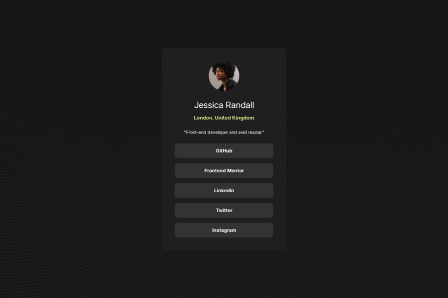
Social Links Profile using with soft transition hover states

@fivetailsdevelopment

Design comparison
SolutionDesign

Solution retrospective
What are you most proud of, and what would you do differently next time?
Made better use of EM and REM for sizing elements appropriately. Will look into using functionality like clamp to handle responsive design container sizing more effectively.
What challenges did you encounter, and how did you overcome them?It was harder to get the sizing close without the Figma file but made for a fun challenge.
Community feedback
- @SteveNoyesPosted 8 months ago
Consider using rem or em instead of px for more flexible and scalable units, particularly for the font-size, padding, and margin values in media queries and other places.
0

Please log in to post a comment
Log in with GitHub
Join our Discord community
Join thousands of Frontend Mentor community members taking the challenges, sharing resources, helping each other, and chatting about all things front-end!
Join our Discord