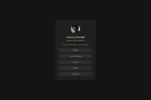
Social Links Profile Using Vanilla CSS

Solution retrospective
I'm proud of doing this task just by sight alone, instead of using Figma to get the exact measurements.
It went pretty smoothly, and much faster than the previous two tasks.
What challenges did you encounter, and how did you overcome them?I had to stop to watch a couple youtube videos, where I figured out that by applying flex-direction: column, the justify-content and align-items functions get swapped.
That was a hurdle that I had been struggling with in the early phases of this task.
I also learned about using var() variables, which helped me clean up my code.
What specific areas of your project would you like help with?I need some tips for magically working faster lol.
Please log in to post a comment
Log in with GitHubCommunity feedback
No feedback yet. Be the first to give feedback on Andre's solution.
Join our Discord community
Join thousands of Frontend Mentor community members taking the challenges, sharing resources, helping each other, and chatting about all things front-end!
Join our Discord