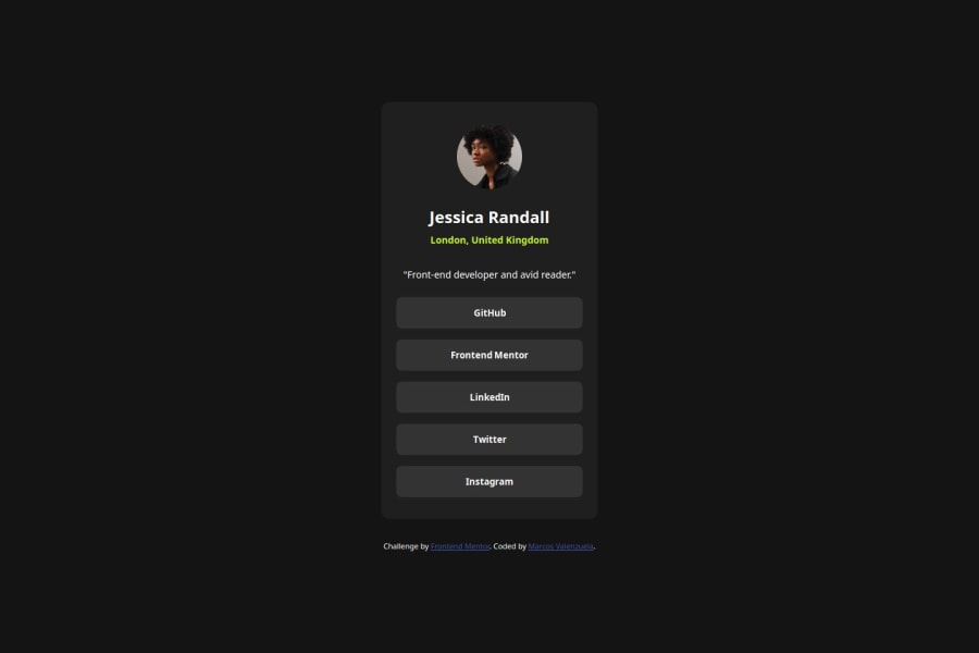
Social-links-profile using semantic HTML and CSS (no figma)


Design comparison

Solution retrospective
This time I wasn't lucky enough to have the figma file, so I did everything by eye, using paddings, margins, font-sizes, etc.
What challenges did you encounter, and how did you overcome them?not having professional design references, I feel that I used spacing values in an ambiguous way, as well as the font-size of the letters, the design was responsive, but the CSS organization is not quite right. I feel that I could be repetitive with some values and I didn't find the way to group them.
What specific areas of your project would you like help with?Mostly with CSS organization as well as HTML semantics.
Community feedback
- @kthgrmPosted about 1 month ago
Try setting a width on your container and you should be all good. The rest of the components are already similar to the design.
0

Please log in to post a comment
Log in with GitHubJoin our Discord community
Join thousands of Frontend Mentor community members taking the challenges, sharing resources, helping each other, and chatting about all things front-end!
Join our Discord