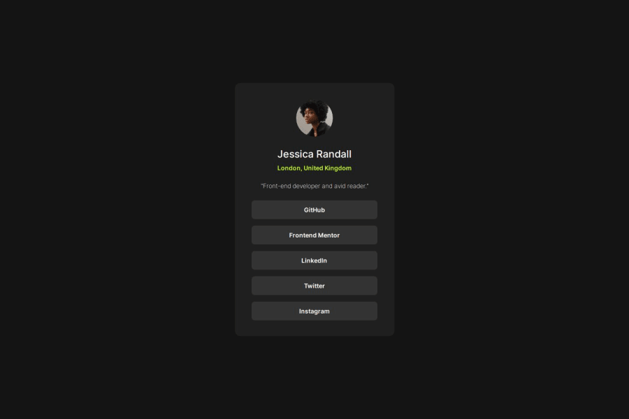
Design comparison
Solution retrospective
I am proud of doing "the buttons" using lists because I didn't know how to use lists properly, so it took a long time but it worked. Next time I will try to focus more on selecting the right classes to change the style atributtes, because this is why I took a long time to do the buttons.
What challenges did you encounter, and how did you overcome them?I had to search a lot about lists and inline-blocks because none of these approaches were working the way I wanted. But after some hard time trying different things it finally worked.
What specific areas of your project would you like help with?My code is probably longer than needed and it could be more organized. Some tips would be gratifying. I also need some help with the @media. When I zoom in my "buttons" don't work properly, but I don't know how to fix it.
Community feedback
Please log in to post a comment
Log in with GitHubJoin our Discord community
Join thousands of Frontend Mentor community members taking the challenges, sharing resources, helping each other, and chatting about all things front-end!
Join our Discord
