Submitted over 1 year agoA solution to the Social links profile challenge
Social Links Profile using HTML and Tailwind CSS
tailwind-css

@hiralinda
Solution retrospective
What are you most proud of, and what would you do differently next time?
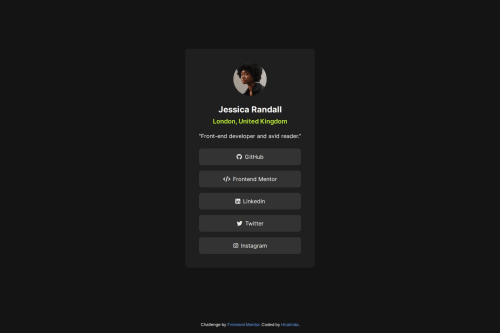
This was a relatively simple implementation of a card flex box using Tailwind to adjust the styling on a more straightforward way. Icons were added to each social link button to be more user-friendly
What challenges did you encounter, and how did you overcome them?My challenge was to set up the size of the card element to match exactly with the preview we are trying to achieve. I still feel that is not accurate but I think it looks good.
Code
Loading...
Please log in to post a comment
Log in with GitHubCommunity feedback
No feedback yet. Be the first to give feedback on hiralinda's solution.
Join our Discord community
Join thousands of Frontend Mentor community members taking the challenges, sharing resources, helping each other, and chatting about all things front-end!
Join our Discord