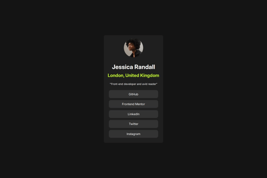
Design comparison
Solution retrospective
I AM VERY CONFIDENT THAT I DID GOOD ON THIS PROJECT. AND WOULD WANT TO BETTER UNDERSTAND THE FLEX BOX PROPERTY.
What challenges did you encounter, and how did you overcome them?SIZING THE DIVS (HEIGHT AND WIDTH)WERE VERY CHALLENGING FOR ME.
What specific areas of your project would you like help with?THE FLEX-BOX PART AND SIZING UNITS.
Community feedback
- @Dpal88Posted 5 months ago
Hi @mamman-naf! Great work on completing this challenge, and your design is spot on!
As far as sizing units go, it really depends on the situation. For font size I would recommend using rem units. Rem units are a relative length unit which just means that they are relative to something else, in this case rem units are relative to the font size of the root element. This means that 1rem is equal to the font size of the html element, which for most browsers the default is 16px. Whereas px units are an absolute length unit, meaning that their size will not change. The nice part about using rem units is that when users change the default font size in their browser the text will scale accordingly.
Also I noticed that you were using percentages for your margins, and I would recommend using rem units instead for margin and padding.
All the different units can make things a little confusing but the more you work with these different units the easier it will become. Also flexbox is a great and essential tool to learn, I wont get into here because it's a lot to explain but I'll link some helpful resources down below.
https://css-tricks.com/snippets/css/a-guide-to-flexbox/ https://www.youtube.com/watch?v=GteJWhCikCk
I hope this helps and if you have any questions feel free to reach out.
Marked as helpful0
Please log in to post a comment
Log in with GitHubJoin our Discord community
Join thousands of Frontend Mentor community members taking the challenges, sharing resources, helping each other, and chatting about all things front-end!
Join our Discord
