

Design comparison

Solution retrospective
I’m most proud of the overall design and accessibility of my project. The use of CSS variables for consistent spacing, colors, and font sizes made the styling process more manageable and reusable. I also ensured that the project is responsive and accessible, with features like ARIA labels, focus-visible styles, and hover effects.
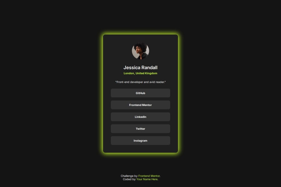
Another highlight is the modern and polished look of the card component, with smooth transitions and a visually pleasing box shadow effect that enhances its appeal. I’m also happy with how the links adapt to hover and focus states, ensuring both usability and interactivity.
What I Would Do Differently Next Time
Next time, I would focus more on:
- Improving Responsiveness: The project is currently optimized for small screens and tablets, but I’d like to add more breakpoints for larger screens to ensure it scales seamlessly across all devices.
- Animations: Adding subtle animations for hover and focus interactions could enhance the user experience further.
- Content Dynamism: Incorporating JavaScript to dynamically update or fetch content for the card would make the project more functional and versatile.
- Testing Accessibility: While I’ve added ARIA labels and focus styles, testing with screen readers and other assistive technologies would ensure better accessibility for all users.
1️⃣ Positioning and Responsiveness
One of the biggest challenges I faced was ensuring the layout remained responsive across various screen sizes. It was tricky to adjust the spacing, alignments, and scaling while keeping the design consistent.
2️⃣ Hover and Focus Interactions
Creating hover and focus effects for the links while ensuring the entire parent element (``) responded correctly took some trial and error. Using pseudo-elements effectively without breaking the structure was particularly challenging.
3️⃣ Accessibility
Ensuring the project met accessibility standards, like adding appropriate ARIA labels and focus-visible styles, required additional research and testing to get it right.
How I Overcame Them
Positioning and Responsiveness
To address the responsiveness issue, I implemented a mobile-first approach with well-defined breakpoints using media queries. I tested the design on different device sizes and adjusted the layout dynamically for each screen width.
Hover and Focus Interactions
I solved the hover and focus challenge by using ::before pseudo-elements on the tags and ensuring their dimensions matched the parent elements. Setting the `` to position: relative and extending the clickable area with the pseudo-element made the interactions seamless.
Accessibility
I referred to MDN Web Docs and accessibility guidelines to understand how to use ARIA attributes effectively. Testing the project with keyboard navigation also helped me refine the focus-visible styles for better usability.
What specific areas of your project would you like help with? What Specific Areas of My Project Would I Like Help With?1️⃣ Hover and Focus Effects
I’m happy with the current hover and focus effects, but I’d love ideas for making them more dynamic or visually engaging. Are there any subtle animations or transitions I could add without overwhelming the user experience?
2️⃣ Accessibility Enhancements
Although I’ve added ARIA labels and focus-visible styles, I’m always open to feedback on improving accessibility. Are there any best practices or tools I should use to ensure my project is fully accessible?
3️⃣ Content Dynamism
I’m considering adding JavaScript to make the card content dynamic (e.g., fetching data or updating content on the fly). I’d appreciate guidance on the best approach to implement this while keeping the project scalable.
Your feedback on any of these areas would be incredibly valuable. Thank you in advance! 😊
Community feedback
- @webthingzPosted 4 months ago
Wow very nice Job! Inspiration for my next challenge! I would like to know how the size is prefectly matching the example. i could not find the size of the box in the assigment.
1P@adambeckercodesPosted 4 months ago@webthingz Thank you so much for your kind words!😊
Regarding the box size: You can use a Chrome browser extension called PerfectPixel . It's a cool tool that lets you overlay an image on your design while working with Developer Tools. This way, you can adjust the size and positioning of elements to perfectly match the example. Then you can edit your code file accordingly.
Sadly, I can't include a screenshot here to show you how it works, but feel free to ask if you need more guidance. Best of luck with your project!
0

Please log in to post a comment
Log in with GitHub
Join our Discord community
Join thousands of Frontend Mentor community members taking the challenges, sharing resources, helping each other, and chatting about all things front-end!
Join our Discord