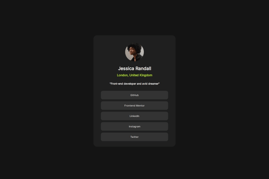
Design comparison
Solution retrospective
Compared to the first project I handled, 75% of the project was done by me and i am proud of the development made.
What challenges did you encounter, and how did you overcome them?Having to add the google fonts and navigate the button areas
Community feedback
- @danielmrz-devPosted 7 months ago
Hello @lotusbomb!
Your solution looks great!
📌 It's recommended to use semantic HTML elements like
<ul>and<li>for creating lists. This ensures that your code is more accessible, maintainable, and semantically meaningful.Here's and example on how you can refactor your code:
After Refactoring
<ul class="list-container">
    <li><a href="#">Github</a></li>
    <li><a href="#">Frontend Mentor</a></li>
    <li><a href="#">LinkedIn</a></li>
    ...
</ul>
By using
<ul>and<li>, you convey the structure of your content more clearly, making it easier for screen readers and search engines to understand. Additionally, it aligns with best practices for HTML semantics.I hope you find this helpful!
Keep up the excellent work!
Marked as helpful0 - @0xabdulkhaliqPosted 7 months ago
Hello there 👋. Congratulations on successfully completing the challenge! 🎉
- I have a suggestion regarding your code that I believe will be of great interest to you.
BODY MEASUREMENTS 📐:
- Use
min-height: 100vhforbodyinstead ofheight: 100vh. Setting theheight: 100vhmay result in the component being cut off on smaller screens, such as mobile devices in landscape orientation
- For example; if we set
height: 100vhthen thebodywill have100vhheight no matter what. Even if the content spans more than100vhof viewport.
- But if we set
min-height: 100vhthen thebodywill start at100vh, if the content pushes thebodybeyond100vhit will continue growing. However if you have content that takes less than100vhit will still take100vhin space.
.
I hope you find this helpful 😄 Above all, the solution you submitted is great !
Happy coding!
Marked as helpful0 - @R3ygoskiPosted 7 months ago
Hello @lotusbomb, congratulations on completing your challenge! It turned out really well and is almost close to the proposed design. Well done!
I'd like to give you some tips. The first thing I noticed is about
index2.html. Since it's not being used, you can delete it.Now, about your base HTML, its structure is somewhat correct, but it's lacking in semantics. Maintaining semantic HTML is extremely important, not only for improving SEO but also for increasing the accessibility of your page. I'll convert some parts to semantic so you can understand better.
<div class="design">could be<main>, because it contains all the main content of your page.<div class="picture">could be<section>, because the content here is related to each other, but it could also be a<header>, because it's introductory content.<div class="buttons">could also be<section>, for the same reason as above. But if you changed these<button>to<a>, then instead of<section>, it would be<nav>, because it would become a dedicated navigation area.
Now, about the structure, the
<p>"Front-end developer and avid dreamer"</p>would make more sense to be outside of the<div>where the buttons are and would make more sense to be in the<div class="picture">, because the buttons form a navigation section, while the top explains about the person's profile.Now, a small CSS tip: avoid using font size values in px; I strongly suggest using rem instead, because rem adapts to the font settings used by the user, thus increasing the accessibility of your page.
Once again, congratulations! Keep practicing and improving! If anything I said is confusing, please ask below, and I'll try to help in the best way possible.
Marked as helpful0@lotusbombPosted 7 months agoThank you so much for this. I'd look into this now @R3ygoski
2
Please log in to post a comment
Log in with GitHubJoin our Discord community
Join thousands of Frontend Mentor community members taking the challenges, sharing resources, helping each other, and chatting about all things front-end!
Join our Discord
