

Design comparison

Solution retrospective
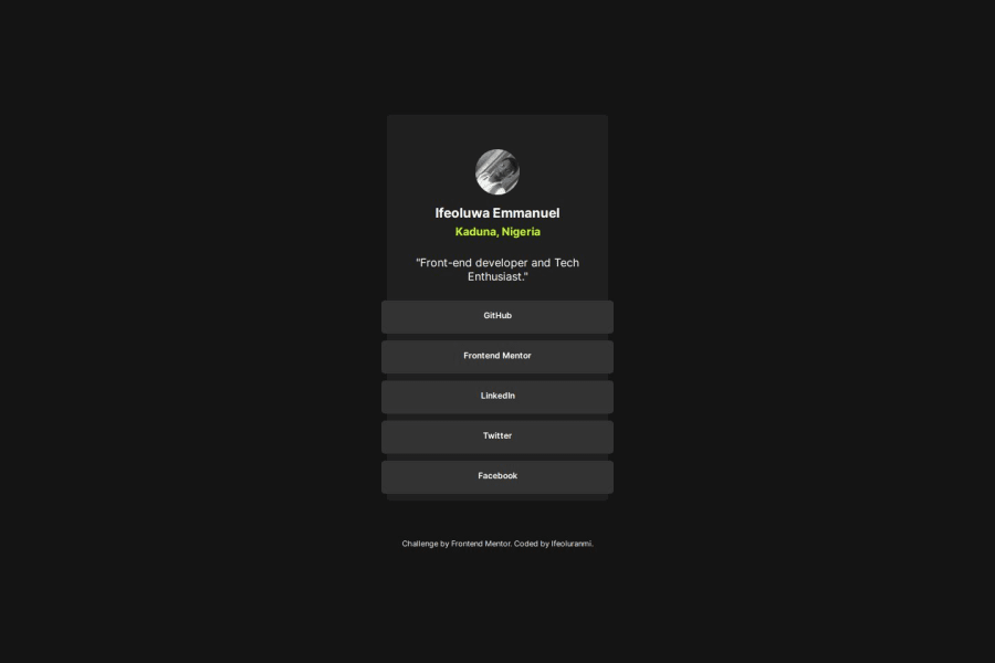
It was nice working on this challenge as i attempt the Idea Test being suggested by Frontend which is making visitors to navigate links via keyboard only, it's quite fun trying out the challenges as it put my knowledge to test, learning and relearning stuffs that i might have forgotten.
Community feedback
- P@dlemvighPosted 3 months ago
The HTML is nice and accessible, but the design have few missing a few things. The links does have a focus state, but not the one from the design. In your case you could have used
li:focus-within { }to style the list items if the links inside have focus.There is no hover state on the links.
There are also some side padding on the card missing.
Nice touch with the ease-in-out transitions
0@IfeoluranmiPosted about 2 months ago@dlemvigh thanks for the feedback, will surely look into that at my leisure and make improvement.
0

Please log in to post a comment
Log in with GitHubJoin our Discord community
Join thousands of Frontend Mentor community members taking the challenges, sharing resources, helping each other, and chatting about all things front-end!
Join our Discord