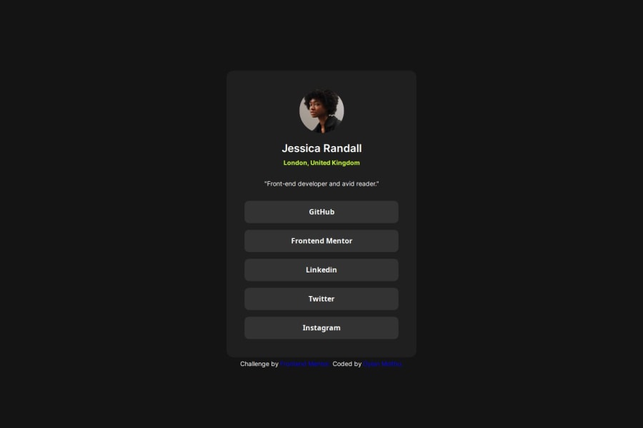
Not Found
Not Found
Not Found
Not Found
Not Found
Not Found
Not Found
Not Found
Not Found
Not Found
Not Found
Not Found
Not Found
Not Found
Not Found
Not Found
Not Found
Not Found
Not Found
Not Found

Submitted

Social Links Profile using HTML and CSS

@dmolthu

Desktop design screenshot for the Social links profile coding challenge

This is a solution for...

  • HTML
  • CSS
1newbie
View challenge

Design comparison


SolutionDesign

Solution retrospective


What are you most proud of, and what would you do differently next time?

I'm most proud of my CSS skills developing and my understanding of certain properties is increasing. The thing that I would do differently is finding out ways to simplify my code because there probably are plenty of lines that might not have to be there.

What challenges did you encounter, and how did you overcome them?

I encountered a few challenges with spacing some elements out on the screen, like the location paragraph from the bio paragraph. I figured it out by just playing around with the spacing with some of the elements parent elements and also using the margin property to space them out from the top.

What specific areas of your project would you like help with?

I would like help with getting a better understanding of spacing and how I could simplify my code by making better use of group selectors and finding out what some of the default values are to some properties.

Community feedback

@amina-refik

Posted

Hello Dylan,

I hope you're having a great learning experience.

Overall, your solution looks quite similar, but it seems to have issues with responsiveness.

As you can observe from this screenshot, when I adjusted the window size, the layout broke. This could be attributed to two main reasons you should consider:

  1. Absolute Positioning: Using position: absolute disrupts the flow of your document. Typically, you would use absolute positioning if you don't need to worry about elements overlapping.

  2. Percentage vs. Fixed Dimensions: When a parent element uses a percentage for sizing and its children use fixed dimensions, overflow issues can arise as the screen size decreases. You can address this by either hiding the overflow or adding a scrollbar if you prefer not to alter the dimensions of the child elements.

The simplest fix I suggest (although you could explore alternative approaches) is to change the height of the card to a fixed dimension. This adjustment should resolve the overlap issue, as demonstrated in this screenshot:

.sec-1 {
  height: 620px;
}

Regarding spacing, I recommend using the design image as a background and reducing the opacity of your main element and try to align them as closely as possible.

Lastly, don't forget to include the page icon.

I apologize if my feedback seems lengthy, but I hope it proves helpful. Happy coding!

Marked as helpful

1

@dmolthu

Posted

@amina-refik Hello! Thank you so much for the response.

I will definitely start working on making certain elements stay in their sections as the screen sizes change, because that is something that I have been having some trouble with and been putting off a little bit, so I am definitely glad you brought this back to my attention.

It also makes sense that you said that the reason could be because I made the parent element a percentage and the children using fixed. I will try to mess around with your suggestions and testing them to see if the children stay within their container.

Thank you so much for the response and no need to apologize for the feedback being lengthy because the longer it is the more it helps! Thank you again happy coding!

0

Please log in to post a comment

Log in with GitHub
Discord logo

Join our Discord community

Join thousands of Frontend Mentor community members taking the challenges, sharing resources, helping each other, and chatting about all things front-end!

Join our Discord