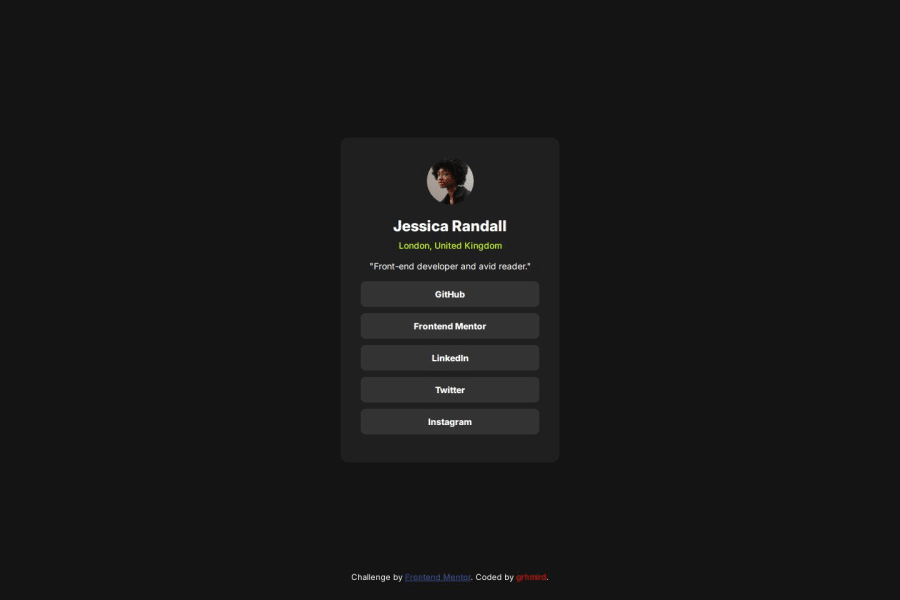
Design comparison
SolutionDesign
Community feedback
- @ImbaMasterPosted 7 months ago
To further improve the achieved results, I recommend focusing on:
- Usage of semantic HTML elements like <main>, <section>, etc., to enhance accessibility and structure.
- Using precise specifications provided in the Figma design file, such as font weights, padding, margins, etc., for a more accurate implementation.
- Using @media queries to ensure the layout displays correctly based on the user's viewport.
- Covering hover states for buttons as part of the task requirements.
These steps should help refine the alignment between design and development even more!
0
Please log in to post a comment
Log in with GitHubJoin our Discord community
Join thousands of Frontend Mentor community members taking the challenges, sharing resources, helping each other, and chatting about all things front-end!
Join our Discord
