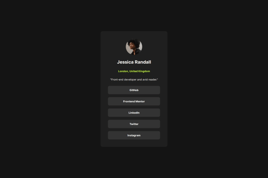
Design comparison
Solution retrospective
I am proud that it is responsive in most of screen sizes, next time I need to it more close to figma design
What challenges did you encounter, and how did you overcome them?I have a problem at first with sizes of the elements in the figma because my chrome was on 500% zoom so things didn't fit well
What specific areas of your project would you like help with?css especially in case of responsive design
Community feedback
- @DylandeBruijnPosted 4 months ago
@BrkCoder
Hiya! π
Congratulations on your solution, it looks very close to the design! I can tell you put a lot of effort into it.
Things I like about your solution π
- Use of semantic HTML elements
- Clear descriptive CSS classes
- Use of CSS custom properties
Things you could improve βοΈ
-
I suggest adding a bit of
padding
to yourbody
element so the card has some space around it on smaller viewports. -
You could add a
min-height: 100vh
to yourbody
element so it takes up the full height of the viewport while still being able to grow when the content inside it grows. -
Be careful with setting a fixed
width
andheight
on your elements. If the content in these elements grows beyond these restrictions youβll run into overflow issues. Keeping theheight
atauto
- whichblock
elements are by default - will be fine in most cases. -
Try putting your links in a list (
ul
) to make your code more semantic. -
You donβt have to wrap your image in a separate
div
, itβs possible to style it directly to achieve the same result.
I hope you find my feedback helpful! π
Let me know if you have more questions and I'll do my best to answer them. πββοΈ
Happy coding! π
Marked as helpful1@BrkCoderPosted 4 months ago@DylandeBruijn thank you for these comments, I learn a lot from your review
0
Please log in to post a comment
Log in with GitHubJoin our Discord community
Join thousands of Frontend Mentor community members taking the challenges, sharing resources, helping each other, and chatting about all things front-end!
Join our Discord