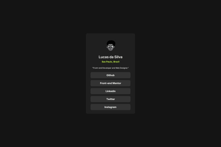
Design comparison
Solution retrospective
Em um determinado momento próximo ao final do projeto tive que dar uma revisada em meus estudos de flexbox para organizar alguns itens sem bagunça.
Community feedback
- @saimasial-bitPosted 15 days ago
"Great job on the solution! The layout looks clean and responsive. However, I noticed that you haven't used semantic HTML elements like <article> and <section>. Adding them would improve accessibility and readability. Also, on smaller screens, the text alignment looks slightly off. Adjusting the padding/margins might help. Keep up the great work!"
Marked as helpful0@lucas-dslPosted 15 days ago@saimasial-bit thank you very much for the feedback, I believe that for the first project on the platform I was still a little lost in your requests and publication, but I guarantee that the next one comes out even better
0
Please log in to post a comment
Log in with GitHubJoin our Discord community
Join thousands of Frontend Mentor community members taking the challenges, sharing resources, helping each other, and chatting about all things front-end!
Join our Discord
