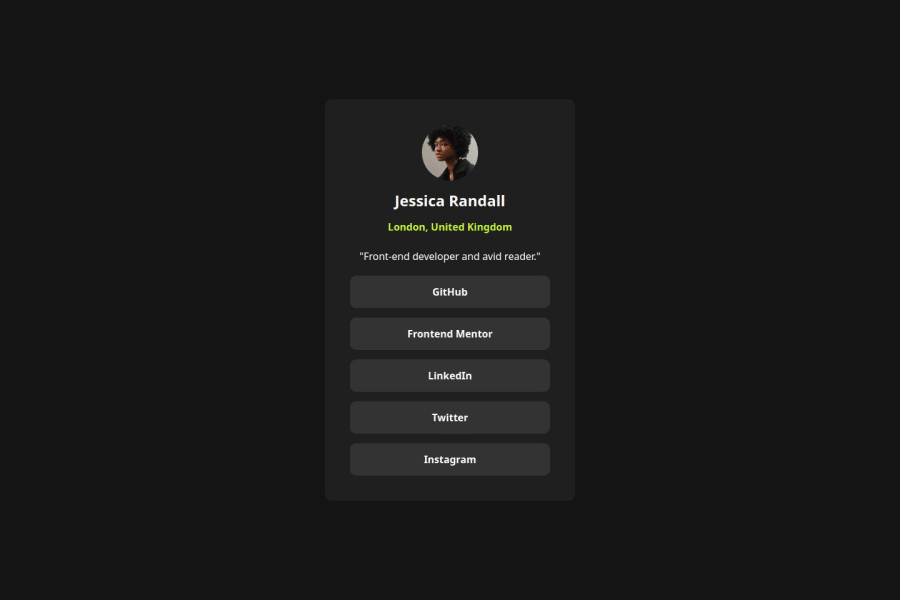
Design comparison
SolutionDesign
Solution retrospective
What are you most proud of, and what would you do differently next time?
nothing
What challenges did you encounter, and how did you overcome them?nothing since it was similar to the qr code
What specific areas of your project would you like help with?making it more responsive so that it shrinks when going below 400px
Please log in to post a comment
Log in with GitHubCommunity feedback
- @Dev-MV6
Hi there 👋, congrats on completing this challenge.
You can simply update the following styles in your CSS to get the result you are looking for:
.container {
  max-width: 400px;
}

li {
  /* width: 35ch; */
  width: 100%;
}
Hope you find this helpful 👍
Marked as helpful
Join our Discord community
Join thousands of Frontend Mentor community members taking the challenges, sharing resources, helping each other, and chatting about all things front-end!
Join our Discord
